I found some interesting articles about website design. I thought that it is good idea to share it with you guys here.
The first is here.
The second one is about graphic design tips.
The last website that I think it is really useful is here.
Enjoy it!!
Saturday, December 12, 2009
Basics of Using 3D Objects
I came across very nice video about how to do basic 3D Objects in Photoshop. Enjoy it.
Photoshop controversies heat up
Another photoshop disaster is making headlines now. Sarah Jessica Parker's image in an Australian poster for the Sex and the City movie sequel. See the image here too.
Also, if you are in Chicago next week... check out the boycott at Polo Ralph Lauren over photoshop!
Also, if you are in Chicago next week... check out the boycott at Polo Ralph Lauren over photoshop!
Friday, December 11, 2009
Designing Book Covers in a Box
Imagine that you were asked to create new jacket designs for a series of books. The only hitch is that you have to follow these rules:
1. Each book cover has to be a photograph of a butterfly specimen box.
2. Within the framework of the box, you must use layers of paper and insect pins.
3. Other than that, you're free to create whatever you want.
A vintage art director thought up this exercise for a roster of designers so that they could create new jacket designs for a series of 21 Vladimir Nabokov titles published by Vintage Books.
Check out this blog for some interesting photos of the results.
Irish Arts Center Gets Infusion of Green
The Irish government has made a $3.5 million grant to help build a new Irish Arts Center in Manhattan.
The most likely location will be at the institution's current location on W. 53rd St., according to the New York Times. The space has exhibitions, educational programs and a 99-seat theater. But the cash-strapped center, founded in 1972, could use a nice infusion of green these days.
The most likely location will be at the institution's current location on W. 53rd St., according to the New York Times. The space has exhibitions, educational programs and a 99-seat theater. But the cash-strapped center, founded in 1972, could use a nice infusion of green these days.
Last Post
I'm pretty sure this will be my last post, unless we're allowed to post after tomorrow. I just wanted to thank everyone for a great semester - it was definitely a fun way for me to start out grad school. Good luck everyone on your presentations tomorrow!
Must See Flash Websites
In my last post I had indicated that my website will be Flash-based. So, for those of you interested in cool interactions - check out the link that I'm posting below. It is a list of 50 "gorgeous" Flash websites. I haven't gotten time to check them all out yet - but I did look at a few. I can only dream of doing this type of stuff, this well; hopefully by the end of the program we will all be able to!
http://www.1stwebdesigner.com/inspiration/50-gorgeous-flash-websites-you-definitely-should-see/
http://www.1stwebdesigner.com/inspiration/50-gorgeous-flash-websites-you-definitely-should-see/
Flashed-Based Project
I really was not liking my visuals for our final project. So, a few days ago I decided to change my site around... it's going to be Flash-based now. I know we discussed usability issues with Flash, but I wanted to try something different. My visuals are all in JPEG format, but I'm going to show a brief example of the interaction tomorrow. With the change of ideas, I have still a lot of work to do - so I'm going to get back to that now. Good luck everyone!
Thursday, December 10, 2009
Presentation help?
Here's a whole site devoted to making your presentations not only more informative, but prettier, too.
Just in case anyone's looking for a boost for Saturday. (Good luck, all. Remember to check your tech BEFORE you present. ;-) )
Just in case anyone's looking for a boost for Saturday. (Good luck, all. Remember to check your tech BEFORE you present. ;-) )
Trans-cultural storytelling
Because, as is well-documented here, I love infographics, I thought I would post a few infographics that manage to explain something despite being created for ublications in other countries and languages. It's amazing how much you can still glean from them, evem when you don't speak the language:
Nine dead in a housing collapse
Holiday Injuries
And finally, a graphic that depicts an American poem: Howl.
Nine dead in a housing collapse
Holiday Injuries
And finally, a graphic that depicts an American poem: Howl.
Choose your own adventure ...
But, as this visual representation explores, you nearly always die in the end.
NFL Uniforms
This post won’t have any type of tutorial for a change… I know, pretty strange for me. Anyway, I was watching some football on Sunday with my Grandma (because I’m cool like that), and the Carolina Panthers/Tampa Bay Buccaneers game was on. My Grandma asked me who I was rooting for, and I said the Panthers. She asked which team that was, so I pointed them out. Then, she proceeded to say she’s rooting for them too. Why? Well, maybe it was partly due to the fact that I was – but she told me it was because she liked their uniforms. It’s pretty cool witnessing the effects that the aesthetics of a uniform can have on people, especially old ladies.
Color me curious
Yes, I just made a reference to an early 90s R&B group. Never mind that.
Let's talk about a possible revolution in the realm of color: a new e-paper technology that has the capability of giving new meaning to the theories of personalization and function in relation to visual aesthetics, according to this article from digitaltrends.com.
The paper, created by Philips Research, can actually change its color in real time thanks to a process called electrophoresis in which individual particles of the paper are suspended and electrically charged. The result is a substance which can change the density and saturation of colors by making colored particles spread across the paper.
Although the technology is being geared toward making "e-skins" for MP3 players or cell phones, the paper could one day expand to greater destinations. In the words of the article: "Imagine colored wallpaper."
As we studied in class, the color of an object can project a world of different emotions and messages. With such technology, those projections could possibly shift and create a whole new mission for visual aesthetics: create what is appealing to the eye -- right now.
Thoughts, anyone?
Perhaps a better title for this blog post would be "In moving color."
In the cards
As I was planning out how to possibly use different flash cards for Saturday's presentation, I bumped into the following site: Flashcardexchange.com.
For only a one-time fee of $20 (OK, $19.95), a person can create and print traditional flashcards or even come up with ones featuring images and videos. The site also features several programs that will show you one side of the card so you have to come up with the other. There is also a feature called "Cram Mode," which piqued my interest.
I realize that everything in the world is digital now, but I don't plan on abandoning the tried and true method of writing everything out. I think my printer has a tough job as it is without giving it more work.
That being said, I can see where a site like this would come in handy if you were taking a final that was based on all of the information you learned, especially if that information was mostly composed a simple facts, figures and definitions.
Has anybody used a site such as this one?
Web Trends for 2010
As the the semester comes to a close and many of are preparing to move forward with our web projects and make them a reality, I'd thought that the following links may be helpful when completing your designs:
Web design Trends for 2010
20 design features to help your blog stand out
Also, great job last night to all who presented in 501! I can't wait to see the end results.
Nick
Web design Trends for 2010
20 design features to help your blog stand out
Also, great job last night to all who presented in 501! I can't wait to see the end results.
Nick
Wednesday, December 9, 2009
The Original YouTube?
Have you ever heard of the mutoscope? Nah, me neither. Patented in 1894, the mutoscope was typically found in arcades, parlors and movie theaters.
It was one of the first motion picture devices, showing popular films of the day such as, "After He Bought Those Monkey Glands" and "The Lost Toupee." You've got to admit, those are some pretty wild film titles.
Some historians say that in many ways, the mutoscope was the original YouTube, which makes it especially interesting, as this article points out.
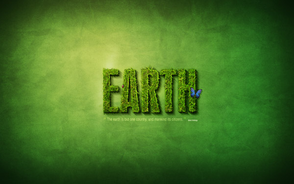
Earth Text
I was very inspired by the “going green” presentation that Steve and Janelle gave in ICM 501 tonight. Therefore, I came home and searched for a Photoshop tutorial on nature. I came across this really cool text tutorial, which combines some photos with the text to create an amazing effect. I will paste the end-effect image from the website below – as well as a link to the tutorial. I haven’t given the tutorial a run through yet to make sure it’s easy to follow, but I will do so when I get more time (after the semester is over).
Click here for the tutorial.
Click here for the tutorial.
Digital Magazine: There's an App for that
The magazine Distill is a digest of photography and design from international fashion. Its latest issue goes all-digital in this app for the iPhone and iTouch. The navigation lets you take in art and copy digitally. You can check it out in this video.
Sorry for the upcoming flood ...
I realized we only have a few days left in the semester, and I have a bunch of things I tagged in my Delicious to mention in the blog!
I'll start with this collection of CG Portraits. We talked about the Uncanny Valley in 501a (as non-human things look more and more human, we think they're cute up to a point where they become unbearably creepy,) and I think these definitely qualify. *shudder* The interesting thing to note is that many of them were partially composed in Photoshop before being taken to other programs.
And since I'm talking about the power of Photoshop, I'll toss this in here too:
I love the Dove advertising campaign, because I think that the constant bombardment of heavily-altered pictures is becoming our vision of reality (just like Autotune has changed our relationship to the sound of the human voice). We talked about photo retouching in class, but does anyone think about the ethical dimensions of these tools? Like the photo of Demi Moore someone posted earlier (and Faith Hill's Redbook Cover Photo), how far is too far? The Ralph Lauren chop job? These are all extraordinarily beautiful women. Why do we need to photoshop them nearly to the point of being as uncanny as the portraits above?
Tuesday, December 8, 2009
Think back ...
... to our discussion of human perception. Remember how designers can manipulate perception to their own ends? I think this is one extreme example, but very cool to watch: 3D Projection.
Deke McClelland – Photoshop Top 40
Deke McClelland at lynda.com is introducing a list of the top 40 features on Photoshop. He is doing this over a span of 40 weeks, and each of the videos are posted to YouTube. I haven’t gotten a chance to watch all of the videos yet, but I did catch some of them – and I think you will all find them helpful and interesting. Some of them are quite long, but if you have the time – they are worth watching. Unless I’m mistaken, there are still quite a few weeks left in the countdown to the #1 Photoshop feature. Below I will post the link to tutorials #40-#26 – as well as embed Deke McClelland’s introduction.
http://www.youtube.com/view_play_list?p=B6CDFA90E256E140
http://www.youtube.com/view_play_list?p=B6CDFA90E256E140
Monday, December 7, 2009
Wacom Tablet info and more
I was reading some of my blogs I subscribe to and came across this article on the Wacom tablet I thought some people might be interested in. It is handy for drawing in photoshop, but I think it will be very valuable when working in our flash course - information animation.
I also found this article "design basics, repetition rocks" interesting since it supported many of our theories of visual aesthetics that we learned in class.
And finally, some more fun photoshop disasters.
I also found this article "design basics, repetition rocks" interesting since it supported many of our theories of visual aesthetics that we learned in class.
And finally, some more fun photoshop disasters.
Arabic Fonts
There are very cool fonts to can be added to your list of fonts. I became obsessed with collecting as many fonts as I can.
I came across a very cool website that has many Arabic fonts. See how Arabic characters are drawn.
Also, there is another amazing website. It has also some Arabic fonts. Try to download one of these and write anything.
I came across a very cool website that has many Arabic fonts. See how Arabic characters are drawn.
Also, there is another amazing website. It has also some Arabic fonts. Try to download one of these and write anything.
Sunday, December 6, 2009
“Web Design in 2 Minutes”
Since our final project is due this week, I thought this video would be appropriate. It runs through someone creating a website, showing a 2+ hour video in 2 minutes. You aren’t going to get any tips from the video since it displays so quickly, but the combination of audio and video is very relaxing to watch. I just sat here and watched it three times in a row. I think it’s very creative.
Designing Products People Will Cherish
What have designers got to do with protecting the earth? Plenty, says designer Nick de la Mare.
He argues that the best way for designers to confront the issue of sustainability is to design products that people love. This way, they will be less likely to toss an item into the landfill just because a slicker, new model comes along. They'll be attached to their older model just because they love it so much. And in the long run, that helps reduce the unsustainable cycle of mass consumption.
De la Mare's essay makes for an interesting, quick read at Creativity Online.
Lost in translation?
In keeping with the theme of different cultures and their effect on international relations, I bumped into the following blog/article that puts a fun spin on different gestures can create different meanings depending on what country you are in.
It's amazing how one simple gesture that might generate a positive response and create the complete opposite just a couple of time zones away. Or vice versa such as the tradition carried on by the Maasai tribe in Kenya of spitting on one's head as a means of giving a blessing. No thank you.
Luckily, graphic design does not have the same potential to get lost in translation. At least I don't think it does. What do you all think?
Trees
So I was watching a movie yesterday, not sure what it was called, and they were standing around the tree when one of the visitors noted that the tree was decorated like Africa from the colors they used on it.
This got me thinking along with website and cultures - how the colors that we use on our trees tell us a lot about our cultural background. For example, my tree is always covered with Disney stuff - but the color of the lights on the tree are blue because I like the snow color rather than the colored lights. My parents tree is decorated in Snoopy and they have colored lights.
So what are some of the cultural notices do you see in trees?
Good luck everyone on your web sites - can't wait to see them on Saturday!
Saturday, December 5, 2009
Water Droplet Video Tutorial
My last several posts have been tutorials, so I’m going to continue with them. The YouTube video that I’m posting below is a tutorial for how to make realistic water droplets. I think the beginning of the tutorial is great, but I don’t like the way it ends. The person that created the tutorial added a ripple effect for distortion at the end, and it doesn’t look right in my opinion. He may have set the percentage a bit too high – or he could have used a different means of distortion. That said, it’s definitely a good tutorial to at least see how water drops can be created on Photoshop. Enjoy!
Cultural Differences In Web Site Design
Putting cultural differences in mind while designing a website is crucial in today's world. Many cultures precise visual communications differently. For example, colors that are appropriated for one nation are not suitable for other.
I came across an interesting article that explains the cultural differences in web design. I also came across an interesting book that explains how to "manage cultural differences".
I believe that it is very important to address these cultural differences for any business or organization.
I came across an interesting article that explains the cultural differences in web design. I also came across an interesting book that explains how to "manage cultural differences".
I believe that it is very important to address these cultural differences for any business or organization.
Friday, December 4, 2009
Hell hath no fury...

Not too harp too much on this Tiger Woods media extravaganza, but I was emailed this photo today in work, clearly a 'Photoshop' job if I ever saw one.
Let's critique. Anyone want to guess at the different tools that were used? The golf club with the hand in the foreground looks inserted from elsewhere . If I had to guess, I would say the bumps on his forehead and above his right eye were done with the liquify tool. A little Burn tool for the black eye perhaps? The golf ball stuck in his ear and missing tooth look kind of sloppily done and amaturish.
A hack job if you ask me. I think anyone in our class could have done a better job, now that the semester is coming to an end and we are soon to receive our Photoshop Merit badges. This would have made for a fun homework assignment, don't you agree?
Thursday, December 3, 2009
Flying no class
When do visual aesthetics become tasteless and low-rent garbage? Just ask the folks in charge of the advertising campaign at discount flyer Spirit Airlines. Immediately following the Tiger Woods' car accident outside his Florida home and all the ensuing speculation, the airline came up with an "Eye of the Tiger sale" featuring an ad on it s Web site of a tiger clad in a black hat crashing into a fire hydrant while behind the wheel of a large SUV. Furthermore, the ad says, "It's a jungle out there! Make sure you avoid all the obstacles and get the lowest fares."
This rubbish, I suppose, is a good example of when the techniques learned about visual aesthetics are used in a harmful way and the power those images can have on the visceral level. Regardless of what you think about the situation, I don't think it paints a good picture of a business to give such heartless and insensitive treatment to anyone, celebrity or not. I've never flown on Spirit Airlines, which is based in Florida, no less. After seeing this ad, I plan on keeping it that way.
What does this say about our society if such advertising is socially acceptable? Any thoughts on this?
For sale
In the spirit of the series of entries that have focused on retouching photos using Photoshop, I offer yet another wrinkle: visual staging. Simply, it is the practice of real estate agents digitally enhancing empty rooms with furniture and other visual elements to help make the area look more appealing.
The agents then use the photos all of their materials such as pamphlets, advertisements and Web sites. Proponents of visual staging say it is a way of showing a home's potential. Those who oppose the practice say it's deceiving to the buyer and might even be in violation of the National Association of Realtors' Code of Ethics and Standards. Article 12 of the document states that "realtors shall be honest and truthful in their real estate communications and shall present a true picture in their advertising, marketing and other representations."
I see no problem with visual staging as long as the realtor stays within the framework of the working space's true potential -- as long as the buyer is not mislead about a room's capability or capacity because of a Photoshopped photo. What do you think?
The Call of the Wild(erness Man)
I want this guy's job. The Wilderness Man is camping out in the middle of nowhere, ready to take your call. Located somewhere in the south of Spain, Rob Cavazos is the wandering star of a campaign for Skype to promote its cheap calls.
When you go to the Phone Box Experiment, the copy says, "Calls to this landline may be expensive on your standard tariff. See if you can call more cheaply on Skype."
The campaign was inspired by the Mojave Phone Booth. In the late '90s throngs of people flocked to this payphone in the middle of the Mojave Desert, miles from any building, just to see what would happen if anyone called it. Or something like that.
Anyway, the relevance of this topic to Visual Aesthetics is ... umm ... Prof. Callahan uses Skype to communicate with her students. There we go.
Wednesday, December 2, 2009
Website Design Expresses Virgin Brand
Virgin, the airline-plus-everything-else company, recently launched a new website that mixes the usual corporate stuff with a lot of fun social media.
Plus, the site has a number of unusual modules for an airline. But then again, Virgin's unique brand is what makes them so interesting. You'll find sections for: travel, lifestyle, media & mobile, music, money, people & planet, and entrepreneur.
Here's an interesting comment about the design, from the creative director at the NY ad agency that created the new website:
"The creative direction for Virgin.com's user interface was to be as reductive as possible. The clean design speaks to the seriousness of the company, and in contrast, the heavy illustrations show the unconventional character that sets Virgin apart. Maintaining this balance on the corporate pages and social pages tied them together seamlessly. "
The full article is in Advertising Age.
Top 15 Photoshop Fire Tutorials
My last post was about making text look like it’s on fire – and again I’m going with the fire stuff. Ironically, I’ve never even lit a match in my life – yet the appearance of fire is quite fun to create on Photoshop. The site below has some issues with loading, but I find the tutorials to be fantastic. My favorite is the first one. This tutorial puts the one I posted last week to shame – as this fire looks much more realistic. It would have been nice if I came across this website sooner, as I could have incorporated some cool effects into my homework. I hope you all find it as interesting as I do!
http://www.developerfox.com/top-15-fire-effect-photoshop-tutorials/62
http://www.developerfox.com/top-15-fire-effect-photoshop-tutorials/62
Monday, November 30, 2009
Photo Sharpening tips
I came across a blog post on sharpening photos in photoshop.
It also has some tips on how to use the Unsharp Mask Filter... which I will admit I didn't understand how to use until reading this tutorial.
It also has some tips on how to use the Unsharp Mask Filter... which I will admit I didn't understand how to use until reading this tutorial.
Sunday, November 29, 2009
Photoshop Fire-Text Tutorial
As you can probably tell, I enjoy making my blog posts about Photoshop tutorials that I come across. A couple weeks ago, my sister was making a card for one of her friends – and wanted some interesting text effects. So, I went through some tutorials, and she really liked one I found that makes the text look like it’s on fire. Unfortunately, I cannot find the exact tutorial that I used – but this tutorial below is very similar. Like most of the tutorials I have posted, interesting effects can be created rather quickly and easily.
http://www.martinity.com/html/tutorials/fire/fire.htm
I have found many other tutorials that I think you will all like, so stayed tuned!
http://www.martinity.com/html/tutorials/fire/fire.htm
I have found many other tutorials that I think you will all like, so stayed tuned!
Tuesday, November 24, 2009
A love story about...industrial objects
German designer Konstantin Grcic is drawing worldwide acclaim for his design work, which just happens to focus on industrial objects.
He says all his design decisions are determined by what the project will do, not how it will look. An exhibition of his work, called "Design Real," focuses on the relationship of particular objects to daily life -- and how their design was influenced by industrial culture. His work is described as being similar to the approach of artists in the "Relational Aesthetics" movement.
The New York Times ran a story about the exhibition in its recent Arts section.
Saturday, November 21, 2009
Motion graphics
Motion graphics are very cool tools that enable the designers to incorrupt motions in their websites.
There are many cool websites that discuss motion graphics and what could be used in a website.
In addition, there are really cool techniques that can be used to give a signature to any design.
One of them is: http://www.onesize.nl/projects/playgrounds-titles-2009.
This video is demonstrating what I mean by motion in design: http://www.onesize.nl/projects/playgrounds-titles-2009
Also, if look at this page and how pictures are designed: http://www.onesize.nl/projects/Defrag-Lament-Element.
The other one is: Vector Meldrew
hopefully, you will enjoy these websites.
Principles of Design
I was searching on the internet to have a better understanding of the principles of design. I found an interesting article that explains these principles.
I thought it is a good idea to share it with you guys.
Here is the link to the article: http://www.digital-web.com/articles/principles_of_design/
Hopefully, you will enjoy it.
I thought it is a good idea to share it with you guys.
Here is the link to the article: http://www.digital-web.com/articles/principles_of_design/
Hopefully, you will enjoy it.
Wednesday, November 18, 2009
Gettin' sloppy with it...

 This is a good example of why you should ALWAYS check your work twice!
Anthony Citrano of BoingBoing states in his article, "In the interview she says she'd rather be a "puma" than a "cougar" - but apparently, the clumsy Photoshop artist decided she was looking too strong in the cover shots - and awkwardly chopped off part of her left thigh. Note how the upper part of her left thigh/hip is basically missing (our right). Did she have some sort of weird car accident that left a wedge of meat missing from it? The fabric even magically floats above the missing thigh. Ha!
Hard to believe that made it to the cover."
http://www.boingboing.net/2009/11/17/demi-moore-is-ralph.html
Tuesday, November 17, 2009
Fonts in Hell
Keeping with the typographically-themed rut in which this blog seems to be, there is a design article in The Times which focuses on typographical gaffes. While I couldn't care less about fonts and type faces, evidently there are people who find walking down a city street virtually nightmarish due to all the different signs and labels to analyze (along with the occasional mistake).
Type in browsers
How Typefaces Will Look On The Web? - check out this blog.
Web Font Specimen- check out the website.
Find out how your typeface looks on the web. This free-to-use resource might be able to improve the overall look of type on your website.
Web Font Specimen- check out the website.
Find out how your typeface looks on the web. This free-to-use resource might be able to improve the overall look of type on your website.
Monday, November 16, 2009
Are you a font nerd?
I happened across this article, Mistakes in Typography Grate the Purists, in the NYT.
Sunday, November 15, 2009
Perparing...
With the test coming up next weekend, I thought this may help. Although I'm sure none of us will be cramming the night before...ahem...they do have a rather helpful section on that too! :)
Friday, November 13, 2009
Web Aesthetics
Two notes:
1. This story is a good follow up to Don Norman's ideas about processing and aesthetics that talks specifically about Web design.
2.This talks about web aesthetics of a different sort. It looks like we're not the only species for whom aesthetics and usability coalesce.
1. This story is a good follow up to Don Norman's ideas about processing and aesthetics that talks specifically about Web design.
2.This talks about web aesthetics of a different sort. It looks like we're not the only species for whom aesthetics and usability coalesce.
Thunder and...
Not sure if it's the gloomy day or what, but while searching the plethora of Photoshop animation tutorials, I came across a pretty cool one for creating lightning. In general though, I'm really surprised at all the options PS offers in terms of creating film-like animations, especially in regards to the time lapse video. As for another well known music video that used animation, how about Take on Me...classic. (of course this is the funny version)
Clipping Mask Tutorial
I was browsing through Photoshop tutorials and found one that I think the class will enjoy. This tutorial makes use of the clipping mask, showing how to make a background image appear inside the text. It’s a pretty simple process, but it allows for very creative, attractive text designs. I know we have finished text and are doing animations this week, but this is still a good thing to learn in Photoshop.
You can actually animate something like this if you wish. For example, you can have the background image move throughout the text, creating a pretty neat looking mask animation. I’ve done a bit of this type of stuff using Flash; applying gradients behind text and having them move back and forth. It adds a little flavor to text.
Here is the tutorial:
http://tutorials.watchandlearnphotoshop.com/tutorials/ps/clipping_mask.html
When we were learning how to use the animation feature in Photoshop I immediately thought of how useful this would be for a really good time lapse. I've done them with video before but I never imagined it would be possible in Photoshop. I'd really like do try to do one for my final project. I only wish I learned of it sooner because I'd like to do one with the leaves changing colors and as we can all see, it's practically winter. Oh well. I want to figure out another way to use it.
While I usually see time lapses for the changing of seasons or day to night, I found this time lapse which was different and pretty amazing.
Design, discovery and humor
I always listen to TED Talks on YouTube.I think that they are amazing.
I would like to share a great video with you. This video is from TED Talks and by: David Carson Enjoy it!!
I would like to share a great video with you. This video is from TED Talks and by: David Carson Enjoy it!!
Thursday, November 12, 2009
'Hammer' time
While watching the Grizzly Bear music video that Bryan shared with us, I was reminded of the music video for Peter Gabriel's "Sledgehammer" in 1986. The video, which uses a high amount of unorthodox animation with an array of visual effects, could have been considered ground-breaking when it came out.
Gabriel's face almost looks as if it's being as it's being animated. I don't tend to remember too many many music videos -- when MTV actually played music videos -- but this one always stuck with me. Besides being a catchy song, the intricate parts moving in rapid syncopation creates an extremely unique visual aesthetic that is still applicable today (for those who have lots of time to work on animation and are amazingly talented at the craft).
Enjoy. Also, can anyone else think of other music videos with highly memorable animation? And no, I don't think anything from the Gorillaz should count.
Emotional design
Don Norman is one of the pioneers who discussed the role of emotions in human life. The brain actually evaluates any design and responds to it.
While I was reading in the internet about emotions and its role in the design process, I came across an article that discusses the function of emotions in any design.
The article is: Emotional about design
In addition, in my blog for 501, I wrote about Design Attractiveness which mentions Don Norman and his design components.
I believe that Norman's criteria are phenomenal and should be totally considered in any design.
Who shot HDR?
Have you heard about High Dynamic Range (HDR) imaging? Here is an interesting blog post which discusses this.
And yes, my headline was a reference to Dallas.
And yes, my headline was a reference to Dallas.
New Word Press Theme
So, many of us in 502 are also taking 501 and have taken to blogging like a duck to water. Well, here is a site to help us create a new theme for our Wordpress blogs.
http://www.yvoschaap.com/wpthemegen/
I am too busy now to attempt it, but someday soon I hope to give it a whirl.
http://www.yvoschaap.com/wpthemegen/
I am too busy now to attempt it, but someday soon I hope to give it a whirl.
Wednesday, November 11, 2009
Letters
I was in Barnes in Noble tonight looking for books on Braille to get myself acqianted on learning it so I can understand the process as someday my niece will be learning it. However, they didn't have any books on it. I continued to browse around and came across a book about post cards. That gave me a thought to bring to the table here. How many of us still write letters and postcards?
My two good friends from back home still write me letters - it's nice to get a picture in the mail and something handwritten. I try to send pictures and letters to my niece and nephew once a month - the last one I sent was a Halloween card along with the family picture that I did for class - granted the family wasn't too happy with it, my nephew (who will be 5 this month) thought it was the funniest thing ever. My brother said he laughed so hard that he almost wet his pants. I'm glad someone thought it was funny.
So even though we are slowing turning away from letter writing, there are still ways that we can incorporate our own visual aesthetics with it. (I made a few other pictures for the nephew for his birthday).
In fact - for my Christmas letter last year (and I will be doing the same this year) - I went month by month and put a picture of what I did that month along with my paragraph about what happened. The family back home loved it as they were able to see my story.
Staying Positive
Reading this weeks article on the how the creative process is not only affected by our visceral reaction to certain extraneous processes but also how it affects what we design (so that our audience has a positive visceral experience as well) was one aspect I hadn't considered. Of course, I am well aware of how easy it is to end up focusing on your problems when you are anxious and stressed out, but sometimes I feel that even experiencing a positive occurrence during troubled times is not enough to lift the funk. So what are we to do? Perhaps we could all watch more videos like these:
In the end though, at least for me, I've always been able to feel good by helping out others. A time tested tradition with proven results. I'm curious though, what put you in a good mood?
In the end though, at least for me, I've always been able to feel good by helping out others. A time tested tradition with proven results. I'm curious though, what put you in a good mood?
Tuesday, November 10, 2009
Extreme Photoshop Makeovers
Perusing around YouTube, I was surprised to find so many videos of people using Photoshop to turn an ugly person into a beautiful person, or vice versa.
http://www.youtube.com/watch?v=N3U2u1IC78U
This was one of the better ones, although I think he could have made the woman even hotter if he had spent some more time and effort on it (juat kidding...kind of). The best part is that it's set to Joe Cocker's heartbreaking version of the song 'You Are So Beautiful'! How fitting!
Another video I stumbled across that I found interesting was about how widely Photoshop is used nowadays in magazines. The video poses an good question:
With Photoshop retouching, have we "created an unobtainable image of perfection that is widely accepted as the standard of beauty?"
http://www.youtube.com/watch?v=YP31r70_QNM&feature=related
You decide.
Monday, November 9, 2009
Dreamy Animation
Since we're looking at animation this week, I thought I'd share this interesting piece of work. What we're doing is nowhere near this elaborate. (It's a video, for one thing, and it's sophisticated claymation, I guess.) But still, if you haven't seen the video, it's just fun and beautiful to watch. It's a video for the band Grizzly Bear, and was created by the artist Alison Schulnik. I was impressed by her wild imagination and unique style.
Some interesting links
As some of you know, I took a one day photoshop class through my work last week. The instructor suggested a couple websites I thought I would pass along.
This website is filled with free resources for the web designer. http://www.webresourcesdepot.com/ Do a search for photoshop and see some brushes and other things you can download and use.
You know the guy who co-wrote our text? Ben Willmore has a website Digital Mastery.
He recommended Lynda, of course, for tutorials, as well as RussellBrown.com. I have yet to have time to look around there, but there you go.
Sunday, November 8, 2009
Great Moments in Wheaties History
After the blaze orange Wheaties box burned holes into my brain this week, it made me wonder: who was the first person to ever appear on the front of the box?
But before I tell you the answer, a word from our sponsor:
Interestingly, the first athlete on the cover of a Wheaties box was not a professional. He was an Olympian: decathlon gold medalist Bob Richards in 1958.
Here's some other Wheaties trivia, which may or may not be helpful at a party sometime, according to the Wheaties website:
• First non-orange Wheaties box: It was a red-and-black package released in 1992 to honor the NBAChampion Chicago Bulls.
• First woman on the front of box: Gold medal gymnast Mary LouRetton in 1984.
• First team to appear on front of box: The 1987 World Champion Minnesota Twins.
• First hockey team: The 1991 Stanley Cup Champion Pittsburgh Penguins.
• First golfer: Lee Trevino in 1969.
• First football player: Walter Payton in 1986.
First race car driver: Dale Earnhardt in 1997.
• Athlete to appear on box most number of times: Michael Jordan – 18 times, including
appearances with the NBA champion Chicago Bulls in 1991, 1993 and 1995. Tiger Woods is second with 16 box appearances. Gee, I wonder if he'll pass Michael?
Saturday, November 7, 2009
Flash and usability- a study
Flash interfaces open new doors for designers. The level of interactivity has increased dramatically. However some people, like Jacob Nielson, claimed that Flash: 99% Bad . I believe that there is always a way to increase the level of interactivity, without murdering the usability of any website.
The designers' Dilemma is always: To Flash or Not To Flash?
I totally believe that there are another ways of using Flash without destroying the usability of the whole website.
I was looking for some information about this issue and I found a study that was conducted to prove that Flash is valuable. The study was conducted through a group called "BIT". Here is a link of the study: http://www.boonelutz.com/portfolio/flashusability/
I enjoyed reading this artcile and I agree the the Flash is a powerful tool.
Friday, November 6, 2009
A Christmas Carol

http://www.thestar.com/entertainment/movies/article/721923--a-christmas-carol-disney-dips-scrooge-in-digital-goo
Carrying on with the Disney theme, I thought I would read a few articles about the new Disney A Christmas Carol starring Jim Carey. I can't imagine all the computer animation that it took to make this film.
make3d.stanford.edu/research.htlm - this is an interesting article about making a image into 3d - I wish there were 40 hours in the day then I could play around with this more.
Speaking of Flash...
I found this nugget of information to be rather disturbing, especially if this knowledge fell into the wrong hands. Apparently, Web developer Tvo Schaap found out that certain Flash applications could allow access to people's Facebook or MySpace data.
The brief article mentions that after Schaap alerted the two social networking giants that they both fixed the glitch, but such information certainly makes me a little weary of capabilities of Flash. Furthermore, as the article puts it: "The vulnerabilities do, however, once more illustrate that many social networking sites still have some work to do when it comes to security."
photoshop woes
I have actually been having a bit of trouble finding the right photoshop tutorials. Many of them are not showing me the specifics of what I am trying to do. I struggled with this last assignment. Mainly, I had trouble making it look authentic. I kept adjusting little elements in the hopes of making look less fake. I'm not sure if I'm happy with the end result but I tried my best.
On a good note, I finally got Photoshop on my own computer. After my 30 day trial was up, I resorted to using the computers on campus to do my assignments. This was extremely inconvenient, but I honestly didn't have the money to purchase it. This week a friend of mine put it on my computer for free. I'm excited to be able to use it at home now.
Photoshop Star Tutorial
It’s fun to check out random Photoshop tutorials in your free time… well at least for me it is. I’ve been doing it a lot lately, creating random pictures/applying effects to pictures just for fun. I recently came across this tutorial, which I think some people in the class may like. It’s relatively simple, but it adds realistic stars to photos. I created snow for one of my projects last week, using a somewhat similar technique; except I had to do more to the layers to get more shape and depth for snow. Anyway, I hope you enjoy this tutorial!
http://www.photoshopessentials.com/photo-effects/starry-sky/

http://www.photoshopessentials.com/photo-effects/starry-sky/
Vanishing Point
Came across this tutorial for using vanishing point. I found it helpful in breaking down the whole process.
Thursday, November 5, 2009
Photoshop with Caution
A blog featuring a collection of apparent (and not so apparent) Photoshop gaffes. Receiving some press coverage lately for its feature of several drastically altered Ralph Lauren models, blog posts range from simple advertisement errors to entire missing limbs and a seeming ignorance of the laws of physics.
Online Business Card
Last week we all designed our business cards, but in retrospect, perhaps we should have designed an online business card instead.
This site talks about some online options to get your name out there.
This site talks about some online options to get your name out there.
The mother of all “Online Business Card” tools. This is almost too pretty…
Wednesday, November 4, 2009
Flashtacular
I've noticed that many times sites either have too much or too little Flash incorporated in their sites. In my opinion one should present a balanced mix of HTML and Flash in order to successfully distribute content, an idea also supported by the results presented in this week's reading.
You can also check out these links for some further reading about when to use Flash and why you should avoid it.
Tuesday, November 3, 2009
Vanishing Point tutorail
Are you confused about using the Vanishing point in Photoshop?
Then, this tutorial is very useful for you.
I think that it really helpful, especially the part where he blends the picture into the building.
Check this video out!!
Then, this tutorial is very useful for you.
I think that it really helpful, especially the part where he blends the picture into the building.
Check this video out!!
I Can't Get No Inspiration
Looking for some design inspiration? Don't know what to put on your Wheaties box assignment? The website for 10e20, a New York-based internet marketing company has put together a bunch of sources to get your creative synapses firing. Some of them you've seen from 501a, like BoingBoing and TED. But there are lots of other interesting sources, too. My favorite is opacity.us, which has an extensive collection of urban ruins from all over the world. You don't see that every day. Well, at least I don't.
Just a few more typography links ...
Would you like to know more about your favorite fonts? (That statement presumes you have a favorite font, but this site is cool even if you don't!) Check out typedia.com. Awesome.
And if you see a neat font somewhere and want to know what font it actually is, just take a picture of it and let What the Font? do the work.
(Interesting fun fact: The font used on highway signs was developed during World War II by what is now the Federal Highway Administration. Officially known as the FHWA Series, the font is also referred to as Highway Gothic and is the inspiration for the Interstate font.)
Friday, October 30, 2009
New on the shelves
I just came across this Associated Press story on a recently released book called "The Bauhaus: Six Masters of Modernism." Written by Nicholas Fox Weber, the book retells the story of a septet of artists who were able to give the German arts school its level of prestige in the early 20th century through their ground-breaking work. One of those artists was our friend, Wasily Kandinsky.
Two others were the husband-wife tandem of Josef and Anni Albers, who actually wound up in Connecticut in 1950 after Josef accepted the position of chairman of the Department of Design at the Yale University School of Art. Josef Albers was one of the forefathers of the modern ideals of visual aesthetics known probably most famously for his series of different colored squares entitled "Homage to the Square." Anni was a renowned textile artist and printmaker in her own right.
Back when I worked in Arkansas, I did a cover story on a traveling art exhibition of Albers and spoke with one of the curators at the Josef & Anni Albers Foundation in Bethany (Conn.). It should be noted that Webber is the foundation's executive director. I just now realized how close that is to Hamden. Has anybody ever visited the foundation's galleries? I certainly will try to one of these days.
first exposures to typography in childhood
Thinking about the fascinating world of typography I was reminded of a distinct childhood memory. I don’t remember exactly what age I become enthralled with Shel Silverstein’s “Where the Sidewalk Ends,” but it is a book I doubt I will ever forget. For those of you who lack this wonderful childhood memory and don’t know what I am talking about, “Where the Sidewalk Ends” is a book consisting of a collection of children’s poetry. The poems are matched with illustrations all by Shel Silverstein and make great use of the art of typography. The way the book connects illustrations with the written poetry can not only feed the wide imagination of the children who read it, but also serves as a great typography tool for learning and discovery.
The Wonderful World of Fonts
Before last week's class, I was quite unaware of just how important fonts are and the extent to which they can affect your target audience. In a search for further knowledge about them, I came across this site which gives some history behind serif and sans serif fonts and presents a few interesting facts (at least I thought so) as well. For example, I was completely oblivious to the idea that serifs help the eye to stick to the line and thus facilitate reading.
After reading the article, I decided that my font library needed a little expanding and went on the hunt for some downloadables. The result of which procured two the following two web sites:
Blambot.com (pay for fonts)
Urbanfonts.com (free fonts)
Both have some really creative designs, although I'm not sure I'm ready to start paying for fonts just yet...even if they do give me a 'super-cool' comic look.
Thursday, October 29, 2009
Photoshop Fun
I have found myself becoming a bit obsessed with Photoshop as of late. I’ve been checking out tutorials online, Photoshopping random pictures, and just playing around with some of the tools.
Additionally, I’ve been surfing the internet for cool pictures that other people have put together with Photoshop. It’s fascinating what people can do! Check out this picture below (I know it’s a little gloomy… but it looks awesome). I am not exactly sure how it was made… I did some research and most sources are telling me that Photoshop was used. I’m assuming images were put together – it looks far too realistic to have been drawn. I know the Flying Dutchman appears in the Pirates of the Caribbean movies; so maybe an image was borrowed from there. I’m not sure, but either way – the visual aesthetics of this image are crazy! I would love to be able to create art like this.

Additionally, I’ve been surfing the internet for cool pictures that other people have put together with Photoshop. It’s fascinating what people can do! Check out this picture below (I know it’s a little gloomy… but it looks awesome). I am not exactly sure how it was made… I did some research and most sources are telling me that Photoshop was used. I’m assuming images were put together – it looks far too realistic to have been drawn. I know the Flying Dutchman appears in the Pirates of the Caribbean movies; so maybe an image was borrowed from there. I’m not sure, but either way – the visual aesthetics of this image are crazy! I would love to be able to create art like this.
A Web for All
Having entered web addresses for several decades now, it is difficult to conceive them being represented in anything other than Latin characters. In a revolutionary move described by one as "the biggest change technically to the internet since it was invented," ICANN is going to approve the use of non-Latin characters in web addresses. Users will now be able to use and register web addresses in a variety of character sets, including Arabic, Hindi, and Cantonese. It remains to be seen whether this move will help or hinder international communication.
Monchrome Master
The black-and-white photos of Ansel Adams sparked my interest in photography in my undergrad years. They were so stark yet beautiful. They seemed to convey the feel of color while using only grayscale.
I was reading recently about his view toward color. His comments were especially interesting because we've spent so much time this fall studying the subject. This quote from 1967 caught my eye:
"I can get—for me—a far greater sense of ‘color' through a well-planned and executed black-and-white image than I have ever achieved with color photography."
Arts critic Richard Woodward says this about this photographer, who died in 1984:
The Infinite Scale in Monochrome
"For Adams, who could translate sunlight's blinding spectrum into binary code perhaps more acutely than anyone before or since, there was an "infinite scale of values" in monochrome. Color was mere reality, the lumpy world given for everyone to look at, before artists began the difficult and honorable job of trying to perfect it in shades of gray."
Back in Adams' day it was often hard to get realistic results with color. I wonder what he'd think about digital photography today. Would he have been more willing to use color with the amazing advances in quality and reproduction?
Woodward writes about Adams' rare use of color in the 1940s in the current issue of Smithsonian Magazine.
in this article in Smithsonian Magazine.
Graphic fonts v.s. browser fonts
Fonts are really important in any design. One of the most important acpect of fonts is to look at the graphic font versus the broswer fonts. Prof. Ewa mentioned that in the last class, but here is an article that explains this issue and provides more details about it: http://expdesign.net/home/articles/graphic-fonts-versus-browser-fonts/.
Colors and moods
I was searching in the Internet for the relationship between colors and moods. I found really interesting article about colors and what kind of mood they do represent.
For example, Blue represents peace, calm, trust, etc. You will find really interesting information about this aspect of colors on http://iit.bloomu.edu/vthc/design/psychology.htm.
Also, the website has amazing articles about colors aspects; for instance, colors that move.
I really advice you to check this website out.
Arial v. Helvetica
I'm a word person. I notice words. I like words. And because of that, I found out I notice fonts, too. How well do you? This site allows you to pick which is the "real" logo — and the answer is the difference between Arial and Helvetica.
If you do well there, try this one.
If you do well there, try this one.
Typography lists
Here's a list of creative uses of typography in Web site logos. Just for some ideas ...
And to go further, the site also has an interesting list of logos that rely on punctuation. I wonder, which fonts are they using?
And to go further, the site also has an interesting list of logos that rely on punctuation. I wonder, which fonts are they using?
Doctor up your images

From Zombie to Vampire, I guess Picnik can help you alter your photos. Enjoy!
Say Hi to Barley the Vampiredog.
Wednesday, October 28, 2009
Creating Business Cards
Since we're working on business cards this week, I though that these Photoshop tutorials on how to create them may be helpful. There's 19 of them, each dealing with a specific look - from modern to cool to sleek.
A timeline for Photoshop
I was reading a blog and thought I would pass along the information for this program for photoshop which keeps track of saved versions of images.
According to the website "PixelNovel Timeline is a revolutionary version control system built for designers who use Adobe Photoshop. Timeline features a unique user interface that allows you to always see the file's history and save file versions and get file versions without switching from the main Photoshop window."
According to the website "PixelNovel Timeline is a revolutionary version control system built for designers who use Adobe Photoshop. Timeline features a unique user interface that allows you to always see the file's history and save file versions and get file versions without switching from the main Photoshop window."
Monday, October 26, 2009
One blog - Two interesting posts
Since we are studying fonts this week, I thought some people might find this post relevant. Rich Typography On The Web: Techniques and Tools
Also this post has some really interesting website treatments.
Showcase of Web Design in Ireland
Also this post has some really interesting website treatments.
Showcase of Web Design in Ireland
Sunday, October 25, 2009
A New Look for CNN
Well, it looks as though CNN has given their site a redesign. Personally, I like the new look and feel their content is much better organized. They've even included an option for users to personalize content and organize by correspondent, subject, or keyword. And how about the use of thirds, huh? So what do you think?
Saturday, October 24, 2009
Typeface kerfuffle
Ikea changed its typeface from Futura to Verdana, and many were unhappy.
Ikea is known for its good design -- visible in its ads, products, store layouts -- so the switch from an iconic font associated with the company to a font designed for screen, not print, for its catalogs is kind of puzzling.
Ikea is known for its good design -- visible in its ads, products, store layouts -- so the switch from an iconic font associated with the company to a font designed for screen, not print, for its catalogs is kind of puzzling.
Friday, October 23, 2009
still learning

I think this is a really interesting Photoshop effect. I have recently started looking for tutorials to create the effects I want. When I am working on a Photoshop project I tend to get to a point where I feel completely stuck. I cannot figure out which tool will manipulate the image the way I want it to. It's incredibly frustrating. This is when I find using the proper tutorials to be most effective.
Sometimes, I wonder if I just capture the image with dumb luck, but usually that is not the case. I've come to realize that time and patience produces the best visual design. While we have been using Photoshop for some time now, I still find myself with a lot to learn
Eyetracking Study
What and how are you looking at websites? That's exactly what researchers were looking at in 2006 under the guidance of Jakob Nielson's eyetracking study. Interestingly enough the study found that people tend to look at information in "F" formations or patterns on websites. This might explain why it's preferable to place navigation on the left side of the screen and logo's tend to be placed in the upper left corner of the screen.
The Power of Perspective
Stressing the importance of perspective in photographs is a new technology emerging out of the University of California, San Diego. Sneakey, giving the user the ability to duplicate a key from an image or a video still, analyzes a key with a given perspective within a photo and aligns it to the proper orientation to allow for duplicating. Save for the application of data points, the software does nothing more than can be achieved in Photoshop by using the transform function (distort, perspective, etc.). The software gives credence to the power of technologies like Photoshop and the many applications they can yield.
Brain Boost
Using the Internet is a simple brain-training activity that can help improve cognitive function in older adults. That’s according to a new study released in Chicago today.
Basically, the study shows that those who learn to use the Internet to seach for information experience a surge of activity in key decision-making and reasoning centers of the brain. This kind of surge helps to slow the brain’s decline as people age. I'm going to test this theory now by searching for free web images. Personally I'm doubtful of any enhanced brain activity on a late Friday afternoon.
Basically, the study shows that those who learn to use the Internet to seach for information experience a surge of activity in key decision-making and reasoning centers of the brain. This kind of surge helps to slow the brain’s decline as people age. I'm going to test this theory now by searching for free web images. Personally I'm doubtful of any enhanced brain activity on a late Friday afternoon.
Looking at the World Differently
My Visual Aesthetics class has made me look at the world in a new light. For example, the other day my brother was wearing light blue jeans and a navy blue shirt that had other blue colors striped in it. So, when I saw him I said, “Nice monochromatic color scheme.” He had no idea what I was talking about.
Additionally, I’ve found myself becoming more and more critical of the visual aesthetics of websites. Having to evaluate websites for class had made me more aware of the behind-the-scenes of the website development. For example, I evaluated ESPN.com, SI.com and NESN.com in my paper last week. Originally, I would have looked at the websites and formed judgments without reason. Now, I can look at them and criticize them or praise them on the basis of color schemes, use of the rule of thirds, white space, etc. It certainly is nice to have knowledge to back up a critique.
Additionally, I’ve found myself becoming more and more critical of the visual aesthetics of websites. Having to evaluate websites for class had made me more aware of the behind-the-scenes of the website development. For example, I evaluated ESPN.com, SI.com and NESN.com in my paper last week. Originally, I would have looked at the websites and formed judgments without reason. Now, I can look at them and criticize them or praise them on the basis of color schemes, use of the rule of thirds, white space, etc. It certainly is nice to have knowledge to back up a critique.
Thursday, October 22, 2009
Hyper-realistic use of Photoshop tools

I came across this picture before I began taking the Visual Aesthetics course. I thought, 'Whoa, what a cool image, I wonder if this is even a real photo' (Its been my computer wallpaper for the past 7 months).
I now lean back and laugh at my naivete.
After becoming familiar with Photoshop in the past month, only now can I understand how the artist took the photo and employed certain Photoshop tools, such as Blur and other simple lighting effects to give the traffic and streetlamps a surreal, hyper-realistic feeling.
Kind of takes away from the mystery of the photo, but hey, it makes me feel smarter to know.
Click on the photo for a more detailed view. : )

Wednesday, October 21, 2009
Spooky Artwork
In the spirit of things, with Halloween just around the corner and an assignment due shortly with a related theme, I searched out a place on-line to find some good examples of ghoulish collections and came across a site promoting an annual Halloween art exhibit in Chicago...the link to which is HERE. They have a sizable collection of original photos and paintings throughout 60 galleries, and my personal favorites include a series of three paintings by Steve Gilberts, who so accurately depicts an ominous night sky using varying shades of blue...muhahahahahahaha!
3D Effects in Photoshop
It seems sometime that it is really hard to create 3D effect in Photoshop, but it is not that bad to learn. All you have to do is to imagine how your shape will be, and draw it. I always wanted to create this kind of effect, but I did not know how. One way of creating 3D effect is to go to the 3D menu in Photoshop and try to explore it. I found a cool tutorial that gave me an idea about 3D effects. The tutorial is Create a Shiny Earth with Photoshop 3D Layers.
The other way is simply trying to draw something and make it looks like 3D.
In my opinion, tutorials are the best way to learn Photoshop tools. The good news is Internet has many of them and lots of the tutorials are totally free.
The other way is simply trying to draw something and make it looks like 3D.
In my opinion, tutorials are the best way to learn Photoshop tools. The good news is Internet has many of them and lots of the tutorials are totally free.
Guggenheim Museum turns 50
An article in the New York Daily News celebrates the Guggenheim Museum's 50th anniversary with 50 interesting facts about the building, its designer, and Guggenheim himself. One popped out at me:
32. One of Guggenheim's favorite painters was Kandinsky; he bought more than 150 works by the artist. An exhibition of Kandinsky's work is on view at the museum through the end of the year.
The museum is also celebrating with free admission today.
32. One of Guggenheim's favorite painters was Kandinsky; he bought more than 150 works by the artist. An exhibition of Kandinsky's work is on view at the museum through the end of the year.
The museum is also celebrating with free admission today.
Monday, October 19, 2009
The man behind the paintings
I don't normally associate a magazine like Vanity Fair with doing an in-depth piece on figure such as Norman Rockwell, but the current issue of the magazine has just that.
"Norman Rockwell's American Dream," written by David Kamp, explores the life of the iconic painter from his less-than-picturesque childhood in New York City to his third marriage to a school teacher. It's definitely worth the time to read it.
The article also contains photographs taken from a new book by Ron Schick, "Norman Rockwell: Behind the Camera." The photos were all posed shots that Rockwell would essentially copy onto the canvas. Several of the photos and paintings used in the article were the ones analyzed in class, including "Girl at Mirror" (1954) and "The Problem We All Live With" (1964).
Furthermore, the Norman Rockwell Museum, which is celebrating its 40th anniversary this year, will debut "ProjectNORMAN" on its Web site next month, giving viewers access to more than 18,000 photos that Schick went through to compose the book.
Mickey Avenue
Continuing with my Disney theme, and since we are going to be talking about typeography soon, I thought it would be interesting to look up Disney Fonts - I came across this really cool website that talks about the type of fonts used at each park. It's amazing how many fonts they use.
Mickeyavenue.com
Mickeyavenue.com
Two things
One, there's more really neat infographics here: http://simplecomplexity.net/, which collects infographics from around the internet. My favorite is this one.
I also found this from the New York Times that talks about the bento box as a way to understand Japanese attentiveness to aesthetics.
I also found this from the New York Times that talks about the bento box as a way to understand Japanese attentiveness to aesthetics.
Saturday, October 17, 2009
Clutter-Busting for News Sites
I always figured most news sites would have pretty well designed home pages -- especially the ones that newspapers create. After all, they design a print layout every day that needs to be clear and easy to use. But in this interesting article, some industry experts complain about cluttered, difficult-to-navigate home pages on most news sites.
Friday, October 16, 2009
Web Sites Past & Present
Soooo...apparently this is what the first web site ever made looked like. I wonder if Tim Berners Lee ever thought that visual aesthetics could be applied to his original design to create something much more interesting...
Visual information
I love a good infographic. Sometimes, it's easier to represent data visually than in words, so a creative infographic does not just educate people, but does so in a way that is striking, memorable and serves as an entry point into a page (physical or digital). The stuff at Information is Beautiful is indeed beautiful.
Thursday, October 15, 2009
Simple but Heavy


The best part about the Star Wars prequels that came out earlier this decade was the first image that was released to the public to whet their ravenous appetites - a sparse teaser poster for 'Episode I: The Phantom Menanc', depicting a young Anakin Skywalker and the fateful shadow of what we all know he will inevitably become. It was a straight mudslide for Lucas from this point on.
This poster shows how powerful a simple image can be...and how Photoshop can help.
You can almost hear the Imperial March theme playing....
Tuesday, October 13, 2009
Blog Usable
Hello, hello! Back again with a link to an interesting blog entitled Pretty Usable. Topics include aesthetics, persuasive design, web standards, and a few others that are an integral part of web page design. I'm still exploring the site, but it seems full of helpful information. What do you think?
Monday, October 12, 2009
Font Lawsuit?
An interesting news article that I came across. NBC is being sued for overusing a font. View the lawsuit here.
Saturday, October 10, 2009
Creating Web Site Awesomeness!
For anyone interested, here are a few helpful hints on creating web sites I found on Cyberindian. It's been an interesting process for me so far and I'm really looking forward to seeing everyone's work.
Wednesday, October 7, 2009
Colors, colors, colors...
I came across a rather useful and interesting web site on colors, which can be found at www.colormatters.com. It discusses a broad range of topics including color theory, why color matters for kids, and even how color effects us...definitely a helpful tool when analyzing web site color schemes as well. I'd be interested to hear if anyone else has found a similar site...
Tuesday, October 6, 2009
Building a picture
I came across this blog about a new program called PhotoSketch. Essentially you draw outlines of images you want and tag them with a description and this program fills in the image by pulling them from the internet into a photoshopped picture.
Apparently the actual site for PhotoSketch is down due to high demand, but this blog gives you a couple examples of how it works. I look forward to trying it when the site is back up.
Apparently the actual site for PhotoSketch is down due to high demand, but this blog gives you a couple examples of how it works. I look forward to trying it when the site is back up.
Monday, October 5, 2009
Farve
 Tonight is the big Vikings vs Packers game and my friend had this posted on his facebook site. I think someone created this the first time he retired. Being from MN I don't know what to think. It will be an intersting game. I thought it was a very well done picture.
Saturday, October 3, 2009
Making room(s)
I came across an interesting article that refers to what the colors of a room in a house can say about the inhabitant. Although I would never go so far as to paint a room midnight blue, I would say it is my favorite color. According to this site, dark blue evokes sadness compared to the calming effect of light blue. Maybe I and our far university should lighten our tastes up to therefore get an extra dose of happy? No thank you.
Another morsel to chew on concerns the color white, which the article says "can make the room seem unfriendly." Is neutrality unfriendly? I don't think so. Considering that white and off-white are popular choices for rooms, I find this to be a bit of an odd statement.
The room I'm currently in features mostly beige walls (I like the calming effect of butterscotch?) although they were this color when I first moved in and painting them is priority No. 4732 right now. What do the color of the rooms in your house say about you?
Friday, October 2, 2009
Those Creative Deviants!
Hey all, I found some really incredible work at a site called deviantart.com which showcases some really fantastic visual artwork ranging from photographs to 3D to digital to flash...pretty much anything you can think of. Definitely a few levels above my Kandinsky, that's for sure! :)
Tuesday, September 29, 2009
Disney Colors
I am what they call addicted to Disney. So I thought it would be interesting to take a look at how Disney is exploring the color world. I like how they titled the different colors - for example Orange Blast Buzz.
http://disney.go.com/disneyhome/disneypaints.html
http://disney.go.com/disneyhome/disneypaints.html
An interesting look at design and usability
I just posted about the site CSS Zen Garden to a blog for 512, but I wanted to share it here, too. The site offers an html site and invites designers to submit their own CSS designs as a way to demonstrate the capabilities of CSS and inspire designers using it. As you flip through the designs, you start to notice how the aesthetics enhance the experience and affect usability, because the content remains the same.
Sunday, September 27, 2009
Things that make you go Wow
Here are some examples of digital art that really did make me go Wow! How about you?
Friday, September 25, 2009
Kadinsky at the Guggenheim
An exhibit of Kandinsky's work opened this month at the Guggenheim in New York. Of course, none of us will probably be able to see it because we're too busy with classes, but maybe during the winter break. Time magazine had an interesting piece about Kandinsky recently. It's not too long, and much easier to read than, say, a chapter of Benkler.
A day in New York
Two weeks ago, I went to New York in order to receive a cargo shipment coming from Canada. I woke up early in the morning. I took my shower and I was set to go. I set up my GPS to get the required directions to LaGuardia airport. Well, the GPS asked me if I want to avoid toll roads, and I didn’t know the meaning of it.Therefore, I chose "yes" to the phrase "avoid toll roads".
I turned my car on and I drove to New York. After two hours of driving, which was very strange, because I went to NY before and it took me one hour and fifteen minutes only to get there, I was very close to reach my destination and began to experience the "worst three hours in my life" part. Apparently, the GPS kept avoiding toll roads and drove me through downtown of New York. Suddenly, in the middle of downtown, the GPS was going creasy and was telling me to go in a cycles in the middle of the downtown. New York downtown was really full of people and traffic and it was the first time for me to drive in a crowded city, such as NY.
I was really terrified and I couldn't get out from there. After three hours of driving in NY downtown without any hope to get out of it, the police caught me crossing traffic light. I got 150$ fine. I was terrified and I asked the police officer of how to get out of this area and he told that going to LaGuardia airport is too hard to describe and I have to get a taxi and follow him. I did exactly what the police officer told me and I got to the airport. I told myself, never come to New York by a car and never choose "avoid toll roads" again.
Photoshop Warning??
Retouched photos in French magazines may soon come with a warning. According to the Daily Telegraph, some politicians are calling for this new law requiring "retouched photograph aimed at changing a person's physical appearance" to have a visible notice of retouching.
They say that the "photos can lead people to believe in a reality that does not actually exist, and have a detrimental effect on adolescents."
The politicians proposing this law want it to cover newspapers and magazines, as well as "billboard photos and those on product packaging, as well as photos used in political campaigns or artistic photos."
Will be interesting to see what happens.
Tuesday, September 22, 2009
Perspality
Reality is what we perceive...or is what we perceive, reality?
This week's readings definitely gave me new, enlightened perspective (no pun intended) on illusion and how the human brain interprets visual information. I was amazed at how easily we can be tricked into seeing things that don't really exist just by altering a few parameters or juxtaposing different colors and shapes. Two of my favorite illusions from this site are the rotating face masks and reverspective. I also found this short video a bit of fun as well. Enjoy!
This week's readings definitely gave me new, enlightened perspective (no pun intended) on illusion and how the human brain interprets visual information. I was amazed at how easily we can be tricked into seeing things that don't really exist just by altering a few parameters or juxtaposing different colors and shapes. Two of my favorite illusions from this site are the rotating face masks and reverspective. I also found this short video a bit of fun as well. Enjoy!
P Squared - Perceive, Perspective
Hello - this is the first time that I have really done a blog. I have tried one before, but oddly enough, thought the lay out for the site was a little find my way around. This will be a good challenge.
Today for work I attended a Women's Conference. It was a great conference and focused on our career paths and where we want to go and how to get there. It was interesting because the topic of how women perceive things is different than men. Just like what we were talking about in class last week, our eyes all see something a little different.
This weekend I had the opportunity to take my Aunt and Uncle (who drove from MN) to various places of CT and NYC. Below is a take on perspective. Enjoy!

Comic Books, Reimagined
Covered, a blog featuring classic comic book covers redrawn and reimagined by contemporary artists, provides an interesting look that the aesthetic decisions made by individuals in this media over the course of several generations. I've never been a big fan of comic books, but I appreciate the illustrations and their effect in bringing the story to life. These new renditions range from fairly close approximations to adding or omitting large portions of the original work. It is intriguing to see what aesthetic choices were made in an attempt to retain the feel of the drawing, while still applying a personal touch.
Award-winning website - Sikorsky.com
I have been working at Sikorsky Aircraft, a helicopter manufacturer based in Stratford CT, since I graduated from QU in Spring 2008 with a degree in English (I had been interning previously).
Although I work for Marketing and Sales at Sikorsky, my desk is conviently located in the Multi-Media Services department, and I actually sit right next to the individual who recently oversaw a complete and total re-haul of our company's website - Sikorsky.com
The previous website was very outdated from a visual design perspective and did not get across the incredible diversity of the products we produce. There was no flash utilized (not that there needs to be to have a good website...or anything...) and the page formatting was very inconsistant (our company logo was all over the place, and on some pages not present at all).
There was also little interaction to be made with the person viewing the site, which is an especially important aspect to have in our business (helicopters should be exciting!)
This new website, which launched in 2008, does a stellar job, in my opinion, of incorporating elements of flash, video, text and sound without being too overbearing and also engaging the customer/viewer immediately by letting them easily select and discover more about whatever particular helicopter model interests them.
Sikorsky.com has won numerous industry awards and has set a benchmark for our competitors to achieve (Eurocopter, Bell, Agusta Westland).
I would love to get some feedback from whoever reads this, which I can then bring to the attention of the site's designer that I sit next to and give him some unbiased feedback.
Thanks!
Monday, September 21, 2009
A Zapper for Pictures
Not that any of us are planning to be paparazzi, but an article about a Russian Billionaire who installed an anti-photo shield on his yacht. Apparently "lasers sweep the surroundings and when they detect a CCD, they fire a bolt of light right at the camera to obliterate any photograph."
I also wanted to take a moment to point to an entry I did on my blog for 501a. I linked to a website featuring "15 Best iPhone Applications for Web Designers." Perhaps someone not in that class might be interested in this list.
I also wanted to take a moment to point to an entry I did on my blog for 501a. I linked to a website featuring "15 Best iPhone Applications for Web Designers." Perhaps someone not in that class might be interested in this list.
Sunday, September 20, 2009
Storytelling
I love how this blog marries illustration and photography with text to tell stories in really beautiful, surprising ways. I especially appreciate her take on visiting Monticello.
Friday, September 18, 2009
Welcome!
Hello everybody,
Welcome to the class blog! Post frequntly, share, browse and comment...
I look forward to see your findigs!
Welcome to the class blog! Post frequntly, share, browse and comment...
I look forward to see your findigs!
Saturday, May 2, 2009
Gender Design
We spoke about this a little, but I was curious as to what were the true differences between masculine and feminine design.
This blog went into a little more detail on this topic and included specifics on what would make a site more masculine or feminine.
Enjoy! - http://www.redpolka.org/blog/archives/001544.html
This blog went into a little more detail on this topic and included specifics on what would make a site more masculine or feminine.
Enjoy! - http://www.redpolka.org/blog/archives/001544.html
Subscribe to:
Posts (Atom)