Wednesday, April 30, 2008
Logo Quiz
I thought this what pretty cool -- Guess the Fake Logo Quiz. It is interesting to see how logos can become so ingrained in our minds, and why their design is so important.
Worth1000
Some cool pics created in Photoshop....I really like the Replacement theory gallery. Very clever.
http://www.worth1000.com/galleries.asp?display=
http://www.worth1000.com/galleries.asp?display=
Tuesday, April 29, 2008
New school and Old school
Check out Bob G Campbell on youtube, he gives great photoshop tips, and he is very clear and concise and easy to understand and follow. This is one of my favorite tutorials, he explains how to use 3 seperate layers to enhance photos, also, some nice layer mask sharpening some techniques.
http://www.youtube.com/watch?v=BLQfva4kWbY
I also came accross this video of an artist using MSpaint (remember that old school window drawing program, to create some really sharp sketches. I still use ms paint every now and again for very minor adjustments.
Old school
http://www.youtube.com/watch?v=eFV9-RuVYRU
Past Work
I was looking through some of the assignments we did over the course of the semester, especially the assignment where we were distorting photos our ourselves and others. It made me think of a picture I photoshopped of myself for facebook, 2 Halloweens ago. Enjoy!
http://hlaboratories.com/derekhalloween.jpg
http://hlaboratories.com/derekhalloween.jpg
Presidential candidates in 4 years
Creative use for Photshop tools:
http://www.huffingtonpost.com/2008/04/27/how-the-presidential-cand_n_98861.html
http://www.huffingtonpost.com/2008/04/27/how-the-presidential-cand_n_98861.html
FLY Fusion
This is just kind of a neat site. I love that there is a ton of information and interactivity, but I don't ever feel overwhelmed by what the site has to offer.
http://www.flyworld.com/
http://www.flyworld.com/
Start with the basics
Nice article on web design basics and design principles in general.
http://www.digital-web.com/articles/principles_of_design/
http://www.digital-web.com/articles/principles_of_design/
Monday, April 28, 2008
Consistency is key
Be consistent. Don't create a five page website with five uniquely designed pages. Make sure that your navigation, text fonts, colors, backgrounds and page layout are consistent across your entire site.
This tip will probably help us all in the long run when we have designed our sites... especially when it comes to time management.
The problem I keep running into is that I cannot decide on which design to go with (not that all of my ideas are so brilliant that I cannot choose) but more because I am indecisive and cannot make a decision already!
What NOT to do
Although we are going to be launching our websites in their entirety, I know some of you are designing your websites to be used in the "real world." If for some reason there is a page that is being fixed, updated, or just plain not ready...
"Usability Tip: Don't use "Under Construction" signs for sections of your site. If a particular page isn't done, don't even have a link to it. Your site will always be under construction in some way, shape or form; or it's getting very stale quickly."
Although it may be common sense, I happen to run into many sites that are "under construction." save all users the hassle of just not linking to it.
Chapter 13 Part 1
Chapter 13: Screen-Based Controls (Widgets)
The main focus of this chapter was on usability of widgets such as pushbuttons, radio buttons, check boxes, drop-down lists, and entry fields.
1. Distinguish Required and Optional Data Entry Fields
-Users should be able to be able to clearly distinguish optional information from required data.
2. Label Data Entry Fields Consistently
- Data entry fields should be labeled consistently so that the same data items is given the same label if it appears on different pages
- if users are familiar with your sites format they are able to navigate with more ease.
- For example, don't sing words or phrases for some labels and short sentence for others.
3. Do Not Make User-Centered Codes Case Sensitive
- Only use Case sensitive if there is a good reason such as a password
- Clearly state to users when using case sensitive codes
4. Label Pushbuttons Clearly
- Pushbuttons should be labeled with exact action to be taken
- Users should know what they are doing
5. label Data Entry Fields Clearly
- Use descriptive labels that let users know exactly what is required in the data field.
6. Minimize User Data Entry
- Do not require users to enter the same information more than once.
- This eliminates one more task for the users do not need to complete.
7. Put Labels Close to Data Entry Fields
- All labels and related information should be close to the data entry field to enable users to easily relate the label and entries required.
8. Allow Users to See Their Entered Data
- This allows users to see if any errors were made and gives them a chance to correct them.
- Designers should also be aware of the length of data entry fields.
9. Use Radio Buttons for Mutually Exclusive Selections
- Radio buttons elicit reliably better performance than drop-down lists.
10. Use Familiar Widgets
- Use widgets that are familiar to your users and in a commonly used manner
- Do not make the mistake of assuming all users are familiar with all widgets
- Perform usability tests to ensure that users will be able to use the widgets on your site.
11. Anticipate Typical Users Errors
- Provide a message when a user makes a mistake and offer a solution or suggestion.
good reference links for web design
http://graphicssoft.about.com/cs/webgallery/ht/aps5webgallery.htm
helpful article about creating web galleries in photoshop
http://www.allgraphicdesign.com/graphicsblog/2008/03/26/photoshop-forums-and-message-boards-the-ultimate-list-of-45-adobe-photoshop-forums/
blog on all things related to web and graphic design
helpful article about creating web galleries in photoshop
http://www.allgraphicdesign.com/graphicsblog/2008/03/26/photoshop-forums-and-message-boards-the-ultimate-list-of-45-adobe-photoshop-forums/
blog on all things related to web and graphic design
Sunday, April 27, 2008
Think about others online
When we have good health, we don't often stop to think about the challenges many people have to overcome in working with computers or online. I came across this site by accident when I was searching for some information on pdfs.
It's about designing websites for people with disabilities. It made me pause to remember to always try to think about others and incorporate ways to facilitate webpage use in any design I do. It's always good to help others.
http://www.wac.ohio-state.edu/webaim/acrbaxs.htm
It's about designing websites for people with disabilities. It made me pause to remember to always try to think about others and incorporate ways to facilitate webpage use in any design I do. It's always good to help others.
http://www.wac.ohio-state.edu/webaim/acrbaxs.htm
Pod People
This is probably one of the best sites I have seen. Great design, use of color, and the music is great too. I think the idea of the iPod silhouettes make an appearance too. Check it out.
The 411 on Lists -- Usability Guidelines, Ch. 12
While some of the following guidelines may seem like common knowledge, lists and the way they are designed can have dramatic impacts on the visual aesthetics and usability of your site.
The following is a summary from Chapter 12 on Lists:
Order Elements to Maximize User Performance
- First, decide whether or not there is an order for items that will facilitate the use of the site
- Ensure that the site is formatted to support that order, and that all pages follow the same order
- Keep in mind that it is the user's logic that should prevail rather than the designer's logic
Place Important Items at Top of the List
- Place a list's most important items at the top
- Users tend to stop scanning a list as soon as they see something relevant
Format Lists to Ease Scanning
- Make lists easy to scan and understand
- The use of meaningful labels, effective background colors, borders, and white space allow users to identify a set of items as a discrete list
Display Related Items in Lists
- Display a series of related items in a vertical list rather than as continuous text
- One study indicated that scanning a horizontal list takes users twenty percent longer than scanning a vertical list
Introduce Each List
- Provide an introductory heading (i.e., word or phrase) at the top of each list
- Allows users to readily understand the reason for having a list of items, and how the items relate to one another
- Users are able to use lists better when they include headings
Use Static Menus
- Use static menus to elicit the fastest possible speed when accessing menu items
- Should put the most frequently used menu items in the first few positions of a menu
- Adaptable menus -- where users are allowed to change the order of the items, elicits reasonably fast performance as well.
- However, one study found that users prefer having static menus, rather than adaptive menus
Start Numbered Items at One
- When items are numbered, start the numbering sequence at "one" rather than "zero"
Use Appropriate List Style
- Use bullet lists to present items of equal status or value
- Use numbered lists if a particular order to the items is warranted
- Bullet lists work best when the items do not contain an inherent sequence, order, or rank
- Numbered lists assign each item in the list an ascending number, making the order readily apparent
- Numbered lists are especially important when giving instructions
Capitalize First Letter of First Word in Lists
- Capitalize the first letter of only the first word of a list item, a list box item, check box labels, and radio button labels
- Only the first letter of the first word should be capitalized unless that item contains another word that would normally be capitalized
Pop Art

Many of you may know the king of pop art is Andy Warhol. He wasn't afraid to use color and thus became very popular because of it. Back in 1969, Esquire magazine put this picture on the cover of their magazine. For one I thought it was very creative and ironic since one of the most noticed of Warhol's art is the one of the Campbell soup cans. Then I looked at it closer and I don't know what program they would have used in 1969 to composite the two shots, but I am sure it wasn't Photoshop. It's funny though because I immediately looked at it and went "Oh that was Photoshopped" as with a lot of other photos out there today. Oh and you probably can't see it, but above the Esquire type it says the magazine sold for $1 in 1969!
Anyway here is a link to some of Andy Warhol's art if you are interested.
Chapter 13 Part 2
Chapter 13 dealt with Widgets. This section primarily deals with data entry fields and how to make them not seem like a pain in the users' butt. Here is my recap for future reference.
- Should always partition long data items into shorter sections to help users detect errors. It is easier to see a 10-digit phone number when it is broken up into 3 sections.
- Keep design of data entries consistent instead of requiring users to go back and forth between keyboard and mouse entry. It will slow them down.
- Prioritize push buttons by location and highlighting. Place the most frequently used push button first in a sequence, or on the left since that is the way users read. Also make the more frequent button the default action when users press enter. i.e. Search button.
- Check box control is the most preferred system when users are allowed to choose multiple selections from a list.
- Be sure to label the desired measurement units, such as pounds, ounces or minutes, rather than having users type them in and increase speed of the data entry process.
- When using open lists show as many options as possible to reduce scrolling.
- Display default values for such things as quantity (1) where default values will be defined.
- Place a blinking cursor automatically at the beginning of the first data entry field. Users should not be required to click on the mouse button to activate the field.
- Make sure that double-clicking won’t cause unnecessary problems. For example, most people tend to double-click a link when only one click is necessary and designers have no control over that. But they do have control over what happens. In order to not confuse the users double-clicking should bring users to the same page as if they would single click the same thing.
- Use open lists instead of drop down menus when choosing one out of many. This will save time and reduce scrolling.
- Text entry fields, or data entry fields, are proven to speed up user performance compared to selecting the information from list format.
- Use at least two radio buttons, or option buttons, together. If users choose not to activate any of the radio buttons, make sure to provide a choice labeled “None”
- Provide auto-tabbing for advanced Web users to significantly reduce data entry times.
The overall concept of this chapter is to design data entry interfaces that require the least amount of time required by the user. Also keep it simple so you don’t confuse the user. SAVE TIME AND DON’T CONFUSE THE USER!
Saturday, April 26, 2008
Ch. 15- Writing Web Content
*Content is the most important part of a web site.
*If the content does not provide the information needed by users, the website will provide little value no matter how easy it is to use the site.
15.1- Make Action Sequences Clear
*When describing an action or task that has a natural order or sequence, structure the content so that the sequence is obvious and consistent.
15.2- Avoid Jargon
*To improve understanding among users who are accustomed to using the jargon term, if may be helpful to put that term in parenthesis.
15.3- Use Familiar Words
*USe words that are familiar to and used frequently by typical users. Words that are more frequently seen and heard are better an dmore quickly recognized.
15.4- Define Acronyms and Abbreviations
*Acronyms and abbreviations should be used sparingly and must be defined in order to be understood by all users.
*Write the word first then in parentheses the acronym, so; Physician Data Query (PDQ).
* Usually, the acronyms and abbreviations are defined on first mention, but users may miss it scrolling.
15.5- Use Abbreviations Sparingly
*The only times to use abbreviations are when they are significantly shorter, save needed space, and will be readily understood by typical users.
15.6- Use Mixed Case w/Prose
*If an item is intended to attract the user's attention, display the item in all uppercase, bold, or italics.
*Do not use these methods for showing emphasis for more than one or two words or a short phrase because they slow reading performance when used for extended prose.
15.7- Limit the Number of Words and Sentences
*To enhance the readability of prose text, a sentence should not contain more than twenty words. A paragraph should not contain more than six sentences.
15.8- Limit Prose Text on Navigation Pages
*When there are many words on navigation pages, users tend to rapidly scan for specific words or begin clicking on many different links, rather than reading the text associated with the links.
15.9- Use Active Voice
* Users benefit from simple, direct language.
*Strong verbs help the user know who is acting and what is being acted upon.
15.10-Write Instructions in the Affirmative
*As a general rule, write instructions in affirmative statements rather than negative statements.
*When giving insturctions, strive to tell users what to do rather than what to avoid doing.
*If the likelihood of making a wrong step is high or the consequences are dire, negative voice may be clearer to the user.
15.11- Make First Sentences Descriptive
*Include the primary theme of a paragraph, and the scope of what it covers, in the first sentence of each paragraph.
*Users tend to skim the first one or two sentences of each paragraph when scanning text.
Colour Emotion (British style)
I found this website about colour emotion. The reason I spelled it like that is because this is a British site. Interesting... this is either the second or third website based out of the UK I have blogged about.
Color emotion is the relationship between color and the viewer's psychological responses. "Warm" is not a real emotion term, but a semantic term for describing the association between colour and temperature. Colour emotion concerns human emotions evoked when seeing colours. "Emotion terms" are those for describing human emotions such as excitement, happiness and anxiety.
Here are some different color emotion theories:
J. W. Goethe developed a colour harmony theory on the basis of his hue circle. In this circle, colours are categorised into two sides, the positive and the negative. The former includes yellow, reddish yellow and yellowish red; the latter includes blue, reddish blue and bluish red.
M. E. Chevreul's theories on colour harmony are based on his colour circle of 64 hues derived from three primary hues: yellow, red and blue.
Ostwald's system is particularly favoured by artists and designers because of its superficial similarity of construction to the way artists mix their paints on the palette.
Munsell's colours in this system are arranged such that the perceptual difference between any two neighbouring colours is nearly constant in each of the three dimensions, Munsell Hue, Munsell Value and Munsell Chroma.
P. Moon and D. E. Spencer proposed a quantitative model of colour harmony, using predictors "colour interval" P. Moon and D. E. Spencer proposed a quantitative model of colour harmony, using predictors "colour interval".
The central idea behind J. Itten's colour harmony theories is that "two or more colours are mutually harmonious if their mixture yields a neutral grey."
The Coloroid system was developed by A. Nemcsics for use in colour design. The aim of the system is to create aesthetic uniformity of a colour space.
The NCS (Natural Colour System) was developed by T. Johansson and S. Hesselgren and, more recently, by A. Hård and L. Sivik. In the NCS, colours are specified in terms of the relative amount of four elementary hues (red, green, yellow and blue) and of black and white.
Colour Appearance Attributes: Every colour has three basic characteristics: hue, lightness and chroma. These are sometimes referred to as the three colour appearance attributes. There are also other attributes used to describe colour appearance, such as brightness, colorfulness and saturation, and some of them are more useful than these three basic attributes in certain circumstances.
The CIE is an international commission of illumination and is responsible for international standards of photometry and colorimetry. The CIE system provides methods for specifying colour stimuli under controlled viewing conditions.
Here is the site... http://colour-emotion.co.uk/whats.html
Science Meets Art
One of my favorites websites is Wired. They always seem to have the most interesting articles.
"Nano Photos Rival Modern Art" is a collection of the real scientific images that were manipulated resulting in some striking images that look more like art than science.
"Nano Photos Rival Modern Art" is a collection of the real scientific images that were manipulated resulting in some striking images that look more like art than science.
Best Text Effects
I found what the site PhotoRoadMap calls the "Best 80 Photoshop Text Effects." They are AWESOME.
What's Old is New Again
I recently discovered a great blog -- Smashing Magazine.
A recent post "Celebration of Vintage and Retro Design," talks about how older graphic designs such as propaganda, ads, and book cover from the 50's, 60's and 70's are influencing a whole new generation of designers.
There are some really cool designs, I love the advertisements from the 1950s.
A recent post "Celebration of Vintage and Retro Design," talks about how older graphic designs such as propaganda, ads, and book cover from the 50's, 60's and 70's are influencing a whole new generation of designers.
There are some really cool designs, I love the advertisements from the 1950s.
Unique Web Designs
Here is a company -- Vandelay Website Design -- and some of their truly unique designs. I especially like the notebook design.
Take a look here.
Take a look here.
Inspiration
Here is a great site I often look to for inspiration when I'm about to create a design. It feature the portfolios of various graphic designers and web developer from around the world. go to the mugshots section of the site and click on the image of a particular designer to view their portfolio.
Design is Kinky
Design is Kinky
Chapter 14 reading
Chapter 14 of the reading focused mainly on aesthetics related to the use of images of websites. The chapter covered several different issues related to this topic, and gave a few main points on each. The first point they made was to use background images on websites sparingly, especially when there is text present on a layer above them, they can easily make a page hard to read. The next point made was that the purpose of an image on a website shoul be clear, in that images which are clickable should be easily recognized as clickable, and images related to text should be close to the text.
Images are often a mjor factor in how fast web pages load. The text recommends splitting large images up into smaller pieces to short load times, and also load times under 5 seconds were considered to be good, 5-10 ok, and over 10 not worth their time.
Audio and video should be used to support an idea on a site, they should not be used just for the sake of using them. They claim this should also be applied to logos. Also important is to not make any of the images on the site look like ad banners, because users will avoid looking at them. Making navigation, for example, look like an add banner would be a grave mistake. Designers should also choose images which users will relate to or be familiar with as opposed to oscure ones that they might not be able to fully associate with the message the website is conveying.
The next section advises designers to use images sparingly on websites, and to only add them where they will in some way enhance the website. It also advises designers to pick images which will not be distracting to the user ( find this a little strange since most images on a website will detract a user's attention from the text based content).
The next section advises the use of charts and graphs when representing data, since it will aid the user in understanding and visualizing what they website is trying to communicate about the data.
Animations should have introductions (i believe "and or") text explaining what they are illustrating. (Some animation is purely decorative though, I wouldn't think that it would need explanation).
Mimicking real life in designs, especially functional designs can aid in user's understanding what they are supposed to do, or how they are supposed to interact with a particular interface.
Thumbnails can help load times on websites because they only load a small preview of the full sized image and you can have multiple thumbnails on a page without inreasing the load time too much. thumbnails will however often increase the number of pages within the website.
The final few points of the chapter were that designers should use images instead of text wherever possible to communicate a message to a user. images are often easier to comprehend and can be universal. (Although we learned last week about how this can differ from culture to culture). Also, photographs whihc support a website are helpful in that they create an atmosphere within the website which leads a user to trust the organization who's website they are viewing. Users are more apt to trust sites with photographs on them.
Friday, April 25, 2008
Flashlights As Art
Stumbled upon this article on Wired.com and thought the photos were pretty interesting. A graffiti artist grabbed some flashlights and ran around in circles at night to create the cool effect. It was something different so I thought I would share. Happy viewing!
Thursday, April 24, 2008
Building Blocks
I'm really liking this website. This article is short and sweet but has some really good points and I love that examples are provided. Enjoy!
http://www.layersmagazine.com/building-blocks.html
http://www.layersmagazine.com/building-blocks.html
Having Fun in Photoshop
A cute article reminding us all that Photoshop should be fun! And some neat tricks I might add.
http://www.layersmagazine.com/having-fun-photoshop.html
http://www.layersmagazine.com/having-fun-photoshop.html
Wednesday, April 23, 2008
Some optical illusions...
Some websites of some cool optical illusions::
http://ava7.com/images/optical-illusion.jpg
http://www.kcl.ac.uk/teares/gktvc/vc/lt/OpticalIllusions/images/opticey2.gif
http://z.about.com/d/puzzles/1/0/v/R/002.jpg
http://antwrp.gsfc.nasa.gov/apod/image/0506/tornado_nguyen_big.jpg
http://www.cartoonstock.com/lowres/rje0116l.jpg
http://z.about.com/d/puzzles/1/0/8/S/015.jpg
Aesthetics and various definitions
This website: http://www.artlex.com/ArtLex/a/aesthetics.html
is like a mini dictionary involving aesthetic terms... take a look.
is like a mini dictionary involving aesthetic terms... take a look.
another site with tips on content organization
http://www.hannonhill.com/news/press-releases/2007/intranets.html
this site is a little simplistic in its approach, but useful for a jumping-off point
this site is a little simplistic in its approach, but useful for a jumping-off point
Useful article on organizing content
http://www.uie.com/articles/folksonomies/
Brief summary of article:
This holds some useful information on how to organize, and ultimately search, content on websites.
A taxonomy is a hierarchical tree structure such as those used in scientific classification schemes. Every web site contains its own unique information, so there is no single classification scheme that works for everybody. Hence taxonomies don’t work well.
Folksonomies are a new user-driven approach to organizing information. Sites with folksonomies include two basic capabilities: they let users add “tags” to information and they create navigational links out of those tags to help users find and organize that information later.
Slice Away!
Here are some sites containing tips or tutorials on slicing. Happy Slicing!
http://www.entheosweb.com/photoshop/slice.asp
http://graphicssoft.about.com/od/webgraphics/a/whyslice.htm
http://www.entheosweb.com/photoshop/layout.asp
http://www.heathrowe.com/tuts/slices.asp
http://www.photoshopcafe.com/tutorials/super%20tutorial%202/website%204.htm
http://www.photoshopcafe.com/tutorials/super%20tutorial%202/website%203.htm (rollovers)
http://www.elated.com/articles/slicing-in-photoshop/
Delta Listens to its Tall Costumers
Delta Airlines will now install economy seats that are roomier. Who doesn't like more legroom!
Take a look
Take a look
History's Five Best Interface Design
I came across another article on Wired.com titled "History's Five Best Interface Designs". So what are they?
1. Manual Camera
2. The Mouse
3. Record Players
4. Manual Transmission
4. The Knob
1. Manual Camera
2. The Mouse
3. Record Players
4. Manual Transmission
4. The Knob
Macro Style
Wired.com published the top ten reader macro photos. All of them are really cool and submitted by readers. I personally am I fan of macro photography. It's all in the smallest details.
http://www.wired.com/culture/art/multimedia/2008/04/gallery_top_10_macro_photos?slide=1&slideView=11
http://www.wired.com/culture/art/multimedia/2008/04/gallery_top_10_macro_photos?slide=1&slideView=11
Tuesday, April 22, 2008
Cool website: How to produce great graphics in Adobe Photoshop
http://www.elated.com/articles/cat/photoshop/
One bullet point they go into is how to create rollover menu bars...
http://www.elated.com/articles/cat/photoshop/
One bullet point they go into is how to create rollover menu bars...
Funny differences between Americans, Canadians, Brits, and Aussies :)
So I found this article that pokes jokes between Americans, Canadians, Brits, and Aussies. It's pretty funny :)
http://www.thehumorarchives.com/joke/Cultural_Differences_Explained
Here is one example:
Aussies: Are extremely patriotic to their beer.
Americans: Are flag-waving, anthem-singing, and obsessively patriotic to the point of blindness. Canadians: Can't agree on the words to their anthem, when they can be bothered to sing them. Brits: Do not sing at all but prefer a large brass band to perform the anthem.
Dinner in the Sky
I came across this randomly and it blows my mind. Check out Dinner in the Sky.
I am pretty afraid of heights, but I might be able to get over it for this!

Image via Dinnerinthesky.com
I am pretty afraid of heights, but I might be able to get over it for this!

Image via Dinnerinthesky.com
Graphics
Is anyone else not having an easy time getting their graphics the way they want them?
I came across this article http://www.sitepoint.com/article/graphics-photoshop-brushes that helps use the brush tool to create graphics.
It is kinda lengthy but it has some really useful advice to take your graphics to the next level. (So we can all fake using photoshop like a pro)
I came across this article http://www.sitepoint.com/article/graphics-photoshop-brushes that helps use the brush tool to create graphics.
It is kinda lengthy but it has some really useful advice to take your graphics to the next level. (So we can all fake using photoshop like a pro)
How To Design A Website in Photoshop
I found this tutorial on how to design an website using photoshop--- Take a good look at the interface and slicing portions. http://www.sitepoint.com/article/design-website-photoshop
I also found this site on usability: if your users can't find the content it is USELESS
http://www.sitepoint.com/article/design-website-photoshop
Nothing could be more relevent to our class!
I also found this site on usability: if your users can't find the content it is USELESS
http://www.sitepoint.com/article/design-website-photoshop
Nothing could be more relevent to our class!
Yah for Yahoo!
Since we just learned about animation for websites when I saw the Yahoo! logo today I thought it was particularly relevant to our class. Since it is Earth day they stuck with the "green" theme. Take a look at how it transforms as you load the page. I think it is pretty creative and a good use of design.
Monday, April 21, 2008
Photoshop Alternatives
For those of us who are now hooked on Photoshop and unfortunately may have limited access to it or just can't afford it, there are some FREE alternatives. In an MSN Tech article they list 14 different photo programs to download, most of them free of charge. They are recommended by PC World which is a bonus and some are even as powerful as our beloved Photoshop. Go ahead, give it a looksie!
Sunday, April 20, 2008
10 Tips on Creating a Cross-Cultural Website
I found this Cross-Cultural Communication Consultants website that listed several ways of communicating with people from other cultures. They created: 10 Tips on Creating a Cross-Cultural Website... figured wow that is just talking to our class, so I just had to post it... here it is
1. Content is King!
2. Sales Pitch
3. Language
4. Colour
5. Claims
6. Technology
7. Page Design
8. Translating Your Site
9. Research the Expectations of your Audience
10. Attracting visitors to your site
They go more in depth for each bullet point... Here is the site http://www.4cinternational.com/index.php?page=articles
Saturday, April 19, 2008
Color Animation
Hi all!
I found this really nice video tutorial on how to do some animated color transitions.
Though someone might want to do something like this for their webpage.
Happy Animating!
http://www.planetphotoshop.com/animating-color-transitions.html
I found this really nice video tutorial on how to do some animated color transitions.
Though someone might want to do something like this for their webpage.
Happy Animating!
http://www.planetphotoshop.com/animating-color-transitions.html
Picture taking 101
In light of our websites and taking our own pictures, and none of us being professional photographers, I thought I would give you a site to help with your picture taking 101.
It is from Wiki How and it is all about how to take a good picture. It includes relevant things such as color and balance of your photographs. It is a good resource for helpful tips.
Check it out
It is from Wiki How and it is all about how to take a good picture. It includes relevant things such as color and balance of your photographs. It is a good resource for helpful tips.
Check it out
Friday, April 18, 2008
So THAT'S what that means...
After reading "How Fluent is Your Interface?" I began searching the web for more information about the importance of creating recognizable symbols. I came across the article "Icons may mean confusion by the dashboard light" on USATODAY.com. The article is a few years old but it is still applicable today.
It talks about how the symbols and indicator lights on car dashboards can be confusing for drivers. A few weeks ago, I encountered this problem with my car. After some independent research in the form of my car's drivers manual -- I learned I had low tire pressure. I will tell you something -- the symbol did not resemble the problem.
While this particular article tackles usability in automobiles, it just goes to show how important it is to design icons and symbols that are easily understandable in all walks of life.
Web Designers are the new rock stars
A great top 40 websites site that is updated weekly! A lot of the designs are in flash, bu, many of them make use of photoshop techniques to achieve desired effects as well.
http://www.designcharts.com/
http://www.designcharts.com/
Common mistakes of novice web designers
I thought this site could help some of us when creating our own sites.
http://www.wozzaworks.com/mistakes.asp
I particularly like #11. I think it's always a good idea to keep designs simple. Too many items on page and the user gets lost.
http://www.wozzaworks.com/mistakes.asp
I particularly like #11. I think it's always a good idea to keep designs simple. Too many items on page and the user gets lost.
One site for all

Jakob Nielsen's paper "International Web Usability" brings home how much the 'worldwide' web has changed the way we do business.
* Today, a one-woman shop can look like a major ad agency and attract clients
all across the globe.
* Trade shows, while still important (and still expensive), are not the only way
to connect with new international customers
* Real-time business can be conducted using all the interactivities the web offers
It also means we have to speak the language of the people we want to reach. Having several language options a website increases the opportunity to accurately share your story and win over new customers.
Although Mr. Nielsen believes the best approach to testing is to go the particular country/ie, the very nature of the web can be used as an alternative method. Testers in other countries can review and comment on the site. If you need a translator, that is a lesser expense than sending a team overseas.
All in all, his paper offers practical ideas that anyone can, and should, consider.
International Usability Testing
 Once again, Jakob Nielsen comes to the rescue with an insightful, succinct paper on International Usability Testing. He talks about the levels of global concerns in web design.
One of his recommendations for testing is to "go to the foreign country yourself". Although this is the most direct, and perhaps the most reliable testing method, it can be done remotely.
As the internet brings us all a little closer into a world community, designing a website that anyone on the globe can access, and understand, is an important consideration that should definitely be considered.
Thanks, Mr. Nielsen.
Thursday, April 17, 2008
Since we are using the slicing tool in Photoshop for our web pages, here is a little article I found...
In addition to optimizing, other reasons for slicing Web graphics are:
1. when you can repeat or stretch a single small image to fill a larger space,
2. creating mouse rollovers and clickable image maps
3. animating portions of a large image.
Here is the link to the rest of the article... http://graphicssoft.about.com/od/webgraphics/a/whyslice.htm
Wednesday, April 16, 2008
Cool, Creative, and Edible!

No, it's not a briefcase full of money... well technically it is, but it is also a cake!
For all you cake lovers out there, myself included, please check out more of their creations on their website (the second link in the post).
Oh and it is also good to point out that the Charm City Cakes website is a perfect example that has both Flash and HTML versions for users. Although minor differences, I prefer the Flash site for this cake maker!
Monday, April 14, 2008
Stop Biting!

I just thought this was fun! It's a little creepy but the designer gets points for creativity.
Check out some more...
http://blog.ivman.com/effective-ads/
Sunday, April 13, 2008
This Weird House
Check out the "The World's Craziest Houses"...There are some crazy designs out there!
via gagling.com
via gagling.com
Saturday, April 12, 2008
Usability Guidelines for Mobiles
Hey yall! I found this article that is really interesting. It is about usability guidelines, but it is for web pages being viewed from mobile devices. It is pretty interesting given the fact that usually people only think about viewing web sites on computers when now we have cell phones, PDAs, and more! This research group based it on cell phones within the UK and created 7 usability guidelines. In their research, they found that 20% of people with cell phones use the internet with them! It is yet another thing to consider when designing a website and I can guarantee that the list is only going to grow longer.
The 7 Usability Guidelines:
1. Meet Users' needs quickly
2. Don't repeat the navigation on every page
3. Clearly distinguish selected items
4. Make user input as simple as possible
5. Only show essential information
6. Place basic browsing controls on the page
7. Design mobile-friendly page layouts
You can read more in depth about this bullet points here:
http://www.webcredible.co.uk/user-friendly-resources/web-usability/mobile-guidelines.shtml
Pretty interesting article......
Friday, April 11, 2008
Ch.5 The Homepage
Hello everyone! I had Ch. 5 from Usability. I have put some bullet points together and I hope this helps everyone for the test tomorrow! Good Luck!
CH. 5- THE HOMEPAGE
*A homepage should clearly communicate the site's purpose, and show all major options available on the Web site.
*Generally, the majority of the homepage should be visible "above the fold" and should contain a limited amount of prose text.
*Designers should provide easy access to the homepage from every page in the site.
5.1- Enable Access to the Homepage
* Many users return to the homepage to begin a new task or to start a task over again.
* Many sites place the organization's logo on the top of every page and link it to the homepage. While many users expect that a logo will be clickable, many other users will not realize that it is a link to the homepage. Therefore, include a link labeled "home" near the top of the page to help those users.
5.2 Show All Major Options on the Homepage
* Users should not be required to click down to the second or third level to discover the full breadth of options on a web site.
* Be selective about what is placed on the homepage, and make sure the options and links presented there are the most important ones on the site.
5.3- Create a Positive First Impression of Your Site
* In terms of conveying quality, the homepage is probably the most important page on a web site.
* You will not get a second chance to make a good first impression on a user.
5.4- Communicate the Web Site's Value and Purpose
* Emphasize what the site offers that is of value to users, and how the site differs from key competitors.
* Do not expect users to read a lot of text or to click into the site to determine a site's purpose.
* Indicating what the site offers that is of value to users, and how the site differs from key competitors is important because most people will spend little time on each site.
5.5- Limit Prose Text on the Homepage
* The first action of most users is to scan the homepage for link titles and major headings.
* Requiring users to read large amounts of prose text can slow them considerable, or they may avoid reading it altogether.
5.6- Ensure the Homepage Looks Like a Homepage
* It is important the pages "lower" in a site are not confused with the homepage.
* Users have come to expect that certain actions are possible from the homepage, such as, finding important links, accessing a site map or index, and conducting a search.
5.7- Limit Homepage Length
* Information that cannot be seen in the first screenful may be missed altogether- this can negatively impact the effectiveness of the web site. If users conclude that what they see on the visible portion of the page is not of interest, they may not bother scrolling to see the rest of the page.
* Some users take a long time to scroll down "below the fold" indicating a reluctance to move from the first screenful to subsequent information. Older users and novices are more likely to miss information that is placed below the fold.
5.8- Announce Changes to a Website
* Users may not know what to do where they are suddenly confronted with a new look or navigation structure. Therefore, you should communicate any planned changes to users ahead of time.
* Following completion of changes, tell users exactly what has changed and when the changes were made. Assure users that all previously available information will continue to be on the site.
5.9- Attend to Homepage Panel Width
* The width of panels seems to be critical for helping users understand the overall layout of a web site.
Usability First
This is a great site in regards to usability...particularly when it comes to the set up process for a website. Usability should be included in the planning process for the site rather than seen as an afterthought.
http://www.usabilityfirst.com/websites/index.txl
http://www.usabilityfirst.com/websites/index.txl
Topics in Usability
The Society for Technical Communication has a great collection usability topics and guidelines. You can find anything from conducting usability testing to career training. Hope it helps!
Access Granted
To supplement the contents of chapter 3 on accessibility, here is the website for the Web Accessibility Initiative. The WAI is concerned with granting equal access to those with disabilities. The website contains guidelines and techniques that can be extremely helpful.
Thursday, April 10, 2008
Learn from the Pros

This is really a great site to learn from experienced designers. Lots of topics we need to understand before developing a website. Check it out.
Chapter 6 - Page Layout
Page layout has to accomplish two things:
1) convey information clearly
2) allow users to easily navigate thru the site
Similar to a newspaper layout
* the most important items are in the top position and use larger, bolder type in headlines
* Unlike a newspaper, iimportant content should be centered near the top because that is how viewers read web pages
It is important that viewers easily recognize the top and bottom of each page.
The proper line length aids in readability.
Page length should fit the purpose of the page.
Scroll only when needed.
Usually, home pages are shorter.
Most important points to consider in page design:
1) White space, clean, uncluttered layout
Users need to easily find information on the page.
2) Be consistent in page layout and navigation
Helps users scan better when they see what they expect on every page.
3) If items are compared, make it easy
It's difficult if information doesn[t fit on a page or too much scrolling is needed.
4) Establish a page hierarchy
Most important items are placed higher up on the page.
5) Align page elements, either vertically or horizontally
Keep it consistent so a user's eyes are not forced to jump around the page.
6) Use fluid layout
This automatically adjusts the page size to monitor resolution for larger sizes (1024 px. x 768 px. or higher)
Non-fluid layout doesn't hurt usability, but most users prefer to be in contol and use all the space their monitors are capable of.
7) Density is % of screen filed with text & graphics
Use white space in moderation.
Too much can make it tougher to scan & often requires unnecessary scrolling.
8) Line length
Users read faster with longer line length (75-100 characters per line)
Make sure text columns are wide enough. Too narrow slows down readability (at least 50 characters per line)
Users prefer shorter length even though it takes longer to read.
9) Use frames when certain navigation functins are needed to access information on the other side of the screen.
Ex. - map of United States
A proven and trusted design principle
Form follows function.
Flash Interface and Usability
I found a very interesting and helpful article titled "Flash Interface and Usability" that discusses how to utilize Flash Interface properly in regards to usability. The author, Merien Kunst, acknowleges through out the article that the area of most importance is usability and how it can either be decreased or increased by implementing Flash. Usability, as defined by the author, is
I thought this article was a good read especially since we are concered with how aesthetics effects usability.
the extent to which a system supports its users in completing their tasks efficiently, effectively, and satisfactorily - which may also include the experience of aesthetic pleasure.
I thought this article was a good read especially since we are concered with how aesthetics effects usability.
Chapter 3: Accessibility
Although I talked about this chapter in a previous post, I felt that I should provide more details. Please refer to my previous post for the brief describtion of the chapter.
1. If a Website is Being built for the U.S. Government it Must Meet all the Requirements of Section 508.
- Section 508 states that Federal agencies must design their websites so that all
users, including those with disabilities, have equal access to information.
2. Desing Forms that are Compatable with Assistive Technologies.
- Online forms must be designed in such a way that those who use assistive
technologies can complete and submit forms like every other user.
3. Do Not Use Color Alone to Convey Information
- Designers must allow for information that is conveyed in color to also be
available without color.
- Use color combinations that can be discriminated by uses with color deficiencies
- Test how Web pages will appear to those with color deficiencies
- Lightness contrast between foreground and background must be high
- Increase the lightness contrast between colors in either end of the spectrum
- Avoid using the combination of light colors from either end of the spectrum
with dark colors from the middle of the spectrum.
4. Allow Users to Skip Repetitive Navigation Links
- Although many designers use routine navigational links in several places on
webpages, it can be a tedious task to wait for the repeated links to be read
- Users with assistive devices should be able to avoid these links when they
desire to do so.
5. Provide Text Equivalents for Non-Text Elements
- Text should be used for all non-text elements such as:
images
symbols
image map regions
animations
applets and programmatic objects
ASCII art
frames
scripts
images used as list bullets
spacers
grapical buttons
sounds
stand-alone audio files
audio tracks of video
video
6. Test Plug-Ins and Applets for Accessibillity
- Developers should test applets and plug-ins to ensure that it can be
interpreted by assistive devies and technology
7. Ensure that Scripts Allow Accessibility
- Make sure that the scripting langauges can be read by assitive technology
- If using mouseovers, ensure that they can be activated using a keyboard
8. Provide Equivalent Pages
- Create text-only pages if their if no other way can be found to allow access
to those with assitive techology
- Text-only pages should be updated just as their non-text counterpart
9. Provide Client-Side Image Maps
10. Mutimedia elements should be synchronized
- Captions and auditory descriptions should be synchronized with the visual
elements.
11. Do Not Require Style Sheets
- Style sheets are used to control the Web page layout and appearance. Therefore
they should not be quired unless they do not compete with assistive devices.
12. Provide Frame Titles
- Titles are important as they allow the user to identify and navigate within
page.
13. Avoid Screen Flicker
- Web pages should not cause the screen to flicker greater than 2 Hz and lower
than 54 Hz
- 5% of the people who live with epilepsy are photosensitive and can have
seizures that are triggered by certian screen flicker frequencies.
Hope this helps!
Wednesday, April 9, 2008
Animation
A good tutorial on animating slides - it covers some things we learned in class, but also adds some cool effects:
http://www.planetphotoshop.com/animated-transitions.html
http://www.planetphotoshop.com/animated-transitions.html
Chapter 2: Optimizing the User Experience
- Information on the web should be displayed in a directly usable format and content should be well organized
- Should be consistent with how the user uses the page
- Do not overload the reader with information
-No pop ups- they are annoying and distracting
-
-Credibility- Should have a frequently asked questions
-site looks well designed
-up to date
-Task sequences
-Allow users to do tasks in the same order across simalar conditions.
(ex: search and checkout processes)
-Reduce Workload
-Let the computer do the work (like remembering things for you)
-Minimize download time
-Not too many pictures/graphics
-Reading vs Printing
-Prepare info with the with the expectation that it will be both read and printed
-When users have to wait
-Let them know how long the download is going to take
Vanishing Point
hello everyone... in lieu of the class's trials and tribulations with the wheaties box assignment, I have found some tutorials of vanishing point. I cannot hear what the sound is due to the computer I'm on, but the video is great. Hope yall enjoy!
http://youtube.com/watch?v=wH6-twlgJhU
http://youtube.com/watch?v=3Kjblk8OlEE
http://youtube.com/watch?v=wH6-twlgJhU
http://youtube.com/watch?v=3Kjblk8OlEE
6 Common Mistakes
Below is a video I found on YouTube about the six common mistakes e-commerce websites make -- particularly that we are well out of the 1990's.
Comparing Apples and Well, Apples
I thought this current event was pertinent to our class and visual aesthetics in general. Recently, the city of New York released a brand new logo for GreenNYC -- a city-wide plan to reduce carbon emissions by 30% the year 2030.
Sounds like that part of the plan has its heart in the right place, but what we should be concerned about is the fact that while NYC wants to trademark their apple symbol for the initiative -- Apple has something to say about. They are concerned that the program's logo looks eerily similar to the famous Apple logo.
Here is a link to the blog where I initially found this information -- Engadget.
It goes to show that on top of everything designers have to take into account when designing -- you have to keep your ear to the ground of what else is out there.
Usability Guidelines Ch.1
Design Process and Evaluation
The best way to get started designing a website is for many different people to propose design solutions. This is called parallel design. Then you should always follow up with usability testing of users to work out any problems with the site.
This chapter discusses 11 steps to get a successful website.
1. Provide Useful Content
- engaging, relevant and appropriate information for your target audience.
- content is most important aspect of the site, more so than navigation and visual design, according to studies.
2. Establish User Requirements
- customer support lines, surveys, interviews, bulletin boards.
- need more communication between users and developers.
- 4 or 5 different sources is a good start.
3. Understand and Meet User's Expectations
-users utilize past experience and knowledge to gage expectations.
-use familiar navigation schemes and formatting to make it easier for them.
4. Involve Users in Establishing User Requirements
- users are most valuable in helping designers know what a system should do, not helping determine the way to have the system do it.
5. Set and State Goals
- set goals of site BEFORE the design process begins.
- determine function, content, audience, and a unique look and feel.
6. Focus on Performance before Preference
- make decisions about navigation, content, format, and interaction before choosing colors and graphics.
7. User Interface Issues
- user level of experience
- computer and connection to Internet
- types of tasks
8. Be Easily Found in the Top 30
-you need appropriate meta-content and page titles, the number of links to the site and updated registration with search engines.
9. Set Usability Goals
- how fast will users find the specific info.
- testing will be more effective this way.
10. Use Parallel Design
- several designers propose ideas and use best elements from each design.
- propose solutions
11. Use Personas
- keeps design team focused on same types of users.
- definition: hypothetical "stand-ins" for actual users that drive the decision making for interfaces. They represent real people.
- typical to use 3 to 5 personas. Include name, age, photo, work and computer proficiency.
Disney dominates the movies...in 3-D
Over the next four years, Disney will release 10 animated films, 8 of which will be in 3-D. They will be continuing the "Toy Story" and "Cars" series as well with a third and second installment respectively.
Disney executives say that the 3-D movies still require audiences to wear those "geeky glasses" but the calibration of the left and right eyes are so fine that viewers rarely have headaches or eye strain problems.
As usual Disney has enlisted the talents of Hollywood's A-Listers including John Travolta, Tom Hanks, Reese Witherspoon, Joan Cusack, and the youngest of the bunch Miley Cyrus. For more information and to read the rest of the article click here.
To Link or Not to Link...
As suggested, I thought I would put together a review of Chapter 10 from the "Research-Based Web Design & Usability Guidelines" which covers the important guidelines concerning the use of links.
I consider links the Internet's bread and butter. The use of hypertext is the essence of web navigation. Linking begins with the homepage and afford users the means to reaching their goal of desired pieces of information.
In order to be effective, there are several guidelines designers should consider in order to have a efficient and effective site design. Many of the guidelines may be considered commom knowledge to a new, tech-savvy generation, but here is an overview of design guidelines for linking:
Use Meaningful Link Labels -- understandable and easily differentiated by users
Link to Related Content -- Users expect designers to know their sites well enough to provide a full list of options
Match Link Names With Their Destination Page -- Help provide user with necessary feedback
Avoid Misleading Cues to Click -- Symbols usually must be combined with at least one other clickability cue
Repeat Important Links -- Establish more than one way to access content
Use Text for Links -- Rather than images
Designate Used Links -- Use color changes
Provide Consistent Clickability Cues -- Avoid minesweeping (users moving cursor around site to explore), examples: underlining, bullets, arrows, placement in the top center, or left or right panels
Ensure Embedded Links are Descriptive
Use 'Pointing-and-Clicking' -- Rather than mousing over, preferred when using cascading menu structure
Use Appropriate Text Link Lengths -- Long enough to be understood, short enough to minimize wrapping
Indicate Internal vs. External Links -- Tell user if a link will take them away from original site
Clarify Clickable Regions of Images -- Users should have to mouse over to find clickable areas
Link to Supportive Information -- Provide definitions and descriptions if/when necessary
Hope this helps, happy linking!
Don't Put Out the Fire!

Tuesday, April 8, 2008
Equal-Opportunity Designers, All are Welcomed!
Usability is an issue for Internet users worldwide. For this reason it is vital that websites be clear, functional, and aesthetically pleasing. As Jakob Nielsen states in Usability 101: Introduction to Usability, "if a website is difficult to use, people leave"(2003). Armed with this knowledge designers are now beginning to take a user-centered design approach which should yield promising results. However, special attention needs to placed on how usability affects those who have disabilities.
Although website functionality and usability has affected us all to some degree, these difficulties are significantly magnified for those with visual, hearing, and motor impairments. To combat some of the accessibility issues that this population may face, the Research-Based Web Design & Usability Guidelines were created. Some of the accessibility guidelines include providing frame titles, providing text equivalents for non-text elements, and utilizing other design elements other than color to indicate information.
Designers must make it a priority to develop websites and applications that will enable those with disabilities to equally access online information efficiently and with ease. People with disabilities may have an already difficult situation and need simpler ways of managing their life, not complicating it.
Monday, April 7, 2008
Interesting Flash
In the spirit of last weeks class discussion I set out to find some websites that use flash well. I came across none other than Ms. Christina Aguileras website. Its pretty cool.
The whole site is based on a retro theme and takes place in her dressing room.
The whole site is based on a retro theme and takes place in her dressing room.
Bug Me Not
I don't know about you, but I get annoyed when after visiting a site for a few minutes, tracking down the information I need, the site then requires me to register -- another seemingly unnecessary step for users depending on the site. I also feel as though I was tricked into spending time on the site and then hitting a roadblock between me and the information I am seeking.
Bugmenot.com is a website designed to combat against this site phenomena. According to the blog-like site, its purpose is to "BugMeNot.com was created as a mechanism to quickly bypass the login of web sites that require compulsory registration and/or the collection of personal/demographic information (such as the New York Times)."
I'm not sure what would take up more of my time, just filling out the annoying online registration forms or finding a way around it using BugMeNot.
Perception Trickery
Here is an interactive perception trick I found via NPR.com.
It helps explain the "binding problem" of the brain and how color and motion can play tricks on our mind.
It helps explain the "binding problem" of the brain and how color and motion can play tricks on our mind.
Saturday, April 5, 2008
Flash site for new college students
 Click on the blackboard for the homepage of a new interactive site for Boston University.
It was designed for accepted students to the School of Education.
Tell me what you think.

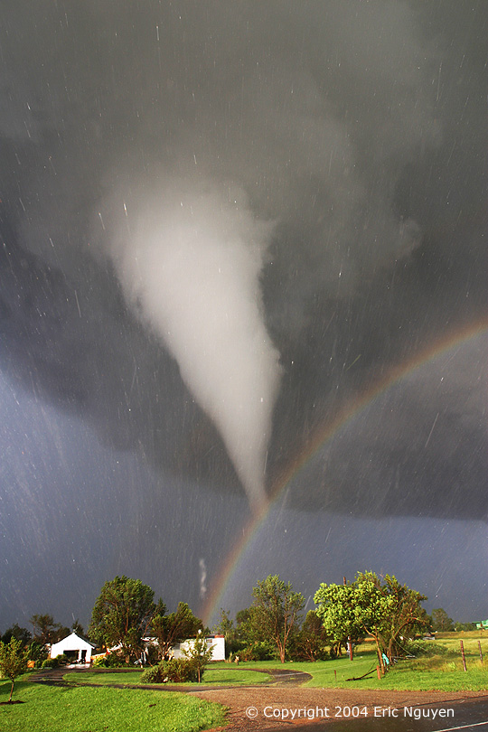
Photoshop Cafe
Here is a cool site called Photoshopcafe. They offer a ton of tutorials, tips and videos... It may come in handy.
Wednesday, April 2, 2008
ShapeShifter style
Now you can create your own animation on the Web. As well as watch other peoples creations on this website called Aniboom. I thought it looked interesting so I figured I would spread the word.
Subscribe to:
Comments (Atom)