I found some interesting articles about website design. I thought that it is good idea to share it with you guys here.
The first is here.
The second one is about graphic design tips.
The last website that I think it is really useful is here.
Enjoy it!!
Saturday, December 12, 2009
Basics of Using 3D Objects
I came across very nice video about how to do basic 3D Objects in Photoshop. Enjoy it.
Photoshop controversies heat up
Another photoshop disaster is making headlines now. Sarah Jessica Parker's image in an Australian poster for the Sex and the City movie sequel. See the image here too.
Also, if you are in Chicago next week... check out the boycott at Polo Ralph Lauren over photoshop!
Also, if you are in Chicago next week... check out the boycott at Polo Ralph Lauren over photoshop!
Friday, December 11, 2009
Designing Book Covers in a Box
Imagine that you were asked to create new jacket designs for a series of books. The only hitch is that you have to follow these rules:
1. Each book cover has to be a photograph of a butterfly specimen box.
2. Within the framework of the box, you must use layers of paper and insect pins.
3. Other than that, you're free to create whatever you want.
A vintage art director thought up this exercise for a roster of designers so that they could create new jacket designs for a series of 21 Vladimir Nabokov titles published by Vintage Books.
Check out this blog for some interesting photos of the results.
Irish Arts Center Gets Infusion of Green
The Irish government has made a $3.5 million grant to help build a new Irish Arts Center in Manhattan.
The most likely location will be at the institution's current location on W. 53rd St., according to the New York Times. The space has exhibitions, educational programs and a 99-seat theater. But the cash-strapped center, founded in 1972, could use a nice infusion of green these days.
The most likely location will be at the institution's current location on W. 53rd St., according to the New York Times. The space has exhibitions, educational programs and a 99-seat theater. But the cash-strapped center, founded in 1972, could use a nice infusion of green these days.
Last Post
I'm pretty sure this will be my last post, unless we're allowed to post after tomorrow. I just wanted to thank everyone for a great semester - it was definitely a fun way for me to start out grad school. Good luck everyone on your presentations tomorrow!
Must See Flash Websites
In my last post I had indicated that my website will be Flash-based. So, for those of you interested in cool interactions - check out the link that I'm posting below. It is a list of 50 "gorgeous" Flash websites. I haven't gotten time to check them all out yet - but I did look at a few. I can only dream of doing this type of stuff, this well; hopefully by the end of the program we will all be able to!
http://www.1stwebdesigner.com/inspiration/50-gorgeous-flash-websites-you-definitely-should-see/
http://www.1stwebdesigner.com/inspiration/50-gorgeous-flash-websites-you-definitely-should-see/
Flashed-Based Project
I really was not liking my visuals for our final project. So, a few days ago I decided to change my site around... it's going to be Flash-based now. I know we discussed usability issues with Flash, but I wanted to try something different. My visuals are all in JPEG format, but I'm going to show a brief example of the interaction tomorrow. With the change of ideas, I have still a lot of work to do - so I'm going to get back to that now. Good luck everyone!
Thursday, December 10, 2009
Presentation help?
Here's a whole site devoted to making your presentations not only more informative, but prettier, too.
Just in case anyone's looking for a boost for Saturday. (Good luck, all. Remember to check your tech BEFORE you present. ;-) )
Just in case anyone's looking for a boost for Saturday. (Good luck, all. Remember to check your tech BEFORE you present. ;-) )
Trans-cultural storytelling
Because, as is well-documented here, I love infographics, I thought I would post a few infographics that manage to explain something despite being created for ublications in other countries and languages. It's amazing how much you can still glean from them, evem when you don't speak the language:
Nine dead in a housing collapse
Holiday Injuries
And finally, a graphic that depicts an American poem: Howl.
Nine dead in a housing collapse
Holiday Injuries
And finally, a graphic that depicts an American poem: Howl.
Choose your own adventure ...
But, as this visual representation explores, you nearly always die in the end.
NFL Uniforms
This post won’t have any type of tutorial for a change… I know, pretty strange for me. Anyway, I was watching some football on Sunday with my Grandma (because I’m cool like that), and the Carolina Panthers/Tampa Bay Buccaneers game was on. My Grandma asked me who I was rooting for, and I said the Panthers. She asked which team that was, so I pointed them out. Then, she proceeded to say she’s rooting for them too. Why? Well, maybe it was partly due to the fact that I was – but she told me it was because she liked their uniforms. It’s pretty cool witnessing the effects that the aesthetics of a uniform can have on people, especially old ladies.
Color me curious
Yes, I just made a reference to an early 90s R&B group. Never mind that.
Let's talk about a possible revolution in the realm of color: a new e-paper technology that has the capability of giving new meaning to the theories of personalization and function in relation to visual aesthetics, according to this article from digitaltrends.com.
The paper, created by Philips Research, can actually change its color in real time thanks to a process called electrophoresis in which individual particles of the paper are suspended and electrically charged. The result is a substance which can change the density and saturation of colors by making colored particles spread across the paper.
Although the technology is being geared toward making "e-skins" for MP3 players or cell phones, the paper could one day expand to greater destinations. In the words of the article: "Imagine colored wallpaper."
As we studied in class, the color of an object can project a world of different emotions and messages. With such technology, those projections could possibly shift and create a whole new mission for visual aesthetics: create what is appealing to the eye -- right now.
Thoughts, anyone?
Perhaps a better title for this blog post would be "In moving color."
In the cards
As I was planning out how to possibly use different flash cards for Saturday's presentation, I bumped into the following site: Flashcardexchange.com.
For only a one-time fee of $20 (OK, $19.95), a person can create and print traditional flashcards or even come up with ones featuring images and videos. The site also features several programs that will show you one side of the card so you have to come up with the other. There is also a feature called "Cram Mode," which piqued my interest.
I realize that everything in the world is digital now, but I don't plan on abandoning the tried and true method of writing everything out. I think my printer has a tough job as it is without giving it more work.
That being said, I can see where a site like this would come in handy if you were taking a final that was based on all of the information you learned, especially if that information was mostly composed a simple facts, figures and definitions.
Has anybody used a site such as this one?
Web Trends for 2010
As the the semester comes to a close and many of are preparing to move forward with our web projects and make them a reality, I'd thought that the following links may be helpful when completing your designs:
Web design Trends for 2010
20 design features to help your blog stand out
Also, great job last night to all who presented in 501! I can't wait to see the end results.
Nick
Web design Trends for 2010
20 design features to help your blog stand out
Also, great job last night to all who presented in 501! I can't wait to see the end results.
Nick
Wednesday, December 9, 2009
The Original YouTube?
Have you ever heard of the mutoscope? Nah, me neither. Patented in 1894, the mutoscope was typically found in arcades, parlors and movie theaters.
It was one of the first motion picture devices, showing popular films of the day such as, "After He Bought Those Monkey Glands" and "The Lost Toupee." You've got to admit, those are some pretty wild film titles.
Some historians say that in many ways, the mutoscope was the original YouTube, which makes it especially interesting, as this article points out.
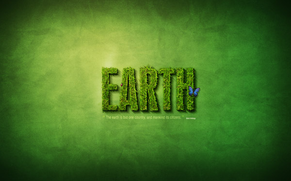
Earth Text
I was very inspired by the “going green” presentation that Steve and Janelle gave in ICM 501 tonight. Therefore, I came home and searched for a Photoshop tutorial on nature. I came across this really cool text tutorial, which combines some photos with the text to create an amazing effect. I will paste the end-effect image from the website below – as well as a link to the tutorial. I haven’t given the tutorial a run through yet to make sure it’s easy to follow, but I will do so when I get more time (after the semester is over).
Click here for the tutorial.
Click here for the tutorial.
Digital Magazine: There's an App for that
The magazine Distill is a digest of photography and design from international fashion. Its latest issue goes all-digital in this app for the iPhone and iTouch. The navigation lets you take in art and copy digitally. You can check it out in this video.
Sorry for the upcoming flood ...
I realized we only have a few days left in the semester, and I have a bunch of things I tagged in my Delicious to mention in the blog!
I'll start with this collection of CG Portraits. We talked about the Uncanny Valley in 501a (as non-human things look more and more human, we think they're cute up to a point where they become unbearably creepy,) and I think these definitely qualify. *shudder* The interesting thing to note is that many of them were partially composed in Photoshop before being taken to other programs.
And since I'm talking about the power of Photoshop, I'll toss this in here too:
I love the Dove advertising campaign, because I think that the constant bombardment of heavily-altered pictures is becoming our vision of reality (just like Autotune has changed our relationship to the sound of the human voice). We talked about photo retouching in class, but does anyone think about the ethical dimensions of these tools? Like the photo of Demi Moore someone posted earlier (and Faith Hill's Redbook Cover Photo), how far is too far? The Ralph Lauren chop job? These are all extraordinarily beautiful women. Why do we need to photoshop them nearly to the point of being as uncanny as the portraits above?
Tuesday, December 8, 2009
Think back ...
... to our discussion of human perception. Remember how designers can manipulate perception to their own ends? I think this is one extreme example, but very cool to watch: 3D Projection.
Deke McClelland – Photoshop Top 40
Deke McClelland at lynda.com is introducing a list of the top 40 features on Photoshop. He is doing this over a span of 40 weeks, and each of the videos are posted to YouTube. I haven’t gotten a chance to watch all of the videos yet, but I did catch some of them – and I think you will all find them helpful and interesting. Some of them are quite long, but if you have the time – they are worth watching. Unless I’m mistaken, there are still quite a few weeks left in the countdown to the #1 Photoshop feature. Below I will post the link to tutorials #40-#26 – as well as embed Deke McClelland’s introduction.
http://www.youtube.com/view_play_list?p=B6CDFA90E256E140
http://www.youtube.com/view_play_list?p=B6CDFA90E256E140
Monday, December 7, 2009
Wacom Tablet info and more
I was reading some of my blogs I subscribe to and came across this article on the Wacom tablet I thought some people might be interested in. It is handy for drawing in photoshop, but I think it will be very valuable when working in our flash course - information animation.
I also found this article "design basics, repetition rocks" interesting since it supported many of our theories of visual aesthetics that we learned in class.
And finally, some more fun photoshop disasters.
I also found this article "design basics, repetition rocks" interesting since it supported many of our theories of visual aesthetics that we learned in class.
And finally, some more fun photoshop disasters.
Arabic Fonts
There are very cool fonts to can be added to your list of fonts. I became obsessed with collecting as many fonts as I can.
I came across a very cool website that has many Arabic fonts. See how Arabic characters are drawn.
Also, there is another amazing website. It has also some Arabic fonts. Try to download one of these and write anything.
I came across a very cool website that has many Arabic fonts. See how Arabic characters are drawn.
Also, there is another amazing website. It has also some Arabic fonts. Try to download one of these and write anything.
Sunday, December 6, 2009
“Web Design in 2 Minutes”
Since our final project is due this week, I thought this video would be appropriate. It runs through someone creating a website, showing a 2+ hour video in 2 minutes. You aren’t going to get any tips from the video since it displays so quickly, but the combination of audio and video is very relaxing to watch. I just sat here and watched it three times in a row. I think it’s very creative.
Designing Products People Will Cherish
What have designers got to do with protecting the earth? Plenty, says designer Nick de la Mare.
He argues that the best way for designers to confront the issue of sustainability is to design products that people love. This way, they will be less likely to toss an item into the landfill just because a slicker, new model comes along. They'll be attached to their older model just because they love it so much. And in the long run, that helps reduce the unsustainable cycle of mass consumption.
De la Mare's essay makes for an interesting, quick read at Creativity Online.
Lost in translation?
In keeping with the theme of different cultures and their effect on international relations, I bumped into the following blog/article that puts a fun spin on different gestures can create different meanings depending on what country you are in.
It's amazing how one simple gesture that might generate a positive response and create the complete opposite just a couple of time zones away. Or vice versa such as the tradition carried on by the Maasai tribe in Kenya of spitting on one's head as a means of giving a blessing. No thank you.
Luckily, graphic design does not have the same potential to get lost in translation. At least I don't think it does. What do you all think?
Trees
So I was watching a movie yesterday, not sure what it was called, and they were standing around the tree when one of the visitors noted that the tree was decorated like Africa from the colors they used on it.
This got me thinking along with website and cultures - how the colors that we use on our trees tell us a lot about our cultural background. For example, my tree is always covered with Disney stuff - but the color of the lights on the tree are blue because I like the snow color rather than the colored lights. My parents tree is decorated in Snoopy and they have colored lights.
So what are some of the cultural notices do you see in trees?
Good luck everyone on your web sites - can't wait to see them on Saturday!
Saturday, December 5, 2009
Water Droplet Video Tutorial
My last several posts have been tutorials, so I’m going to continue with them. The YouTube video that I’m posting below is a tutorial for how to make realistic water droplets. I think the beginning of the tutorial is great, but I don’t like the way it ends. The person that created the tutorial added a ripple effect for distortion at the end, and it doesn’t look right in my opinion. He may have set the percentage a bit too high – or he could have used a different means of distortion. That said, it’s definitely a good tutorial to at least see how water drops can be created on Photoshop. Enjoy!
Cultural Differences In Web Site Design
Putting cultural differences in mind while designing a website is crucial in today's world. Many cultures precise visual communications differently. For example, colors that are appropriated for one nation are not suitable for other.
I came across an interesting article that explains the cultural differences in web design. I also came across an interesting book that explains how to "manage cultural differences".
I believe that it is very important to address these cultural differences for any business or organization.
I came across an interesting article that explains the cultural differences in web design. I also came across an interesting book that explains how to "manage cultural differences".
I believe that it is very important to address these cultural differences for any business or organization.
Friday, December 4, 2009
Hell hath no fury...

Not too harp too much on this Tiger Woods media extravaganza, but I was emailed this photo today in work, clearly a 'Photoshop' job if I ever saw one.
Let's critique. Anyone want to guess at the different tools that were used? The golf club with the hand in the foreground looks inserted from elsewhere . If I had to guess, I would say the bumps on his forehead and above his right eye were done with the liquify tool. A little Burn tool for the black eye perhaps? The golf ball stuck in his ear and missing tooth look kind of sloppily done and amaturish.
A hack job if you ask me. I think anyone in our class could have done a better job, now that the semester is coming to an end and we are soon to receive our Photoshop Merit badges. This would have made for a fun homework assignment, don't you agree?
Thursday, December 3, 2009
Flying no class
When do visual aesthetics become tasteless and low-rent garbage? Just ask the folks in charge of the advertising campaign at discount flyer Spirit Airlines. Immediately following the Tiger Woods' car accident outside his Florida home and all the ensuing speculation, the airline came up with an "Eye of the Tiger sale" featuring an ad on it s Web site of a tiger clad in a black hat crashing into a fire hydrant while behind the wheel of a large SUV. Furthermore, the ad says, "It's a jungle out there! Make sure you avoid all the obstacles and get the lowest fares."
This rubbish, I suppose, is a good example of when the techniques learned about visual aesthetics are used in a harmful way and the power those images can have on the visceral level. Regardless of what you think about the situation, I don't think it paints a good picture of a business to give such heartless and insensitive treatment to anyone, celebrity or not. I've never flown on Spirit Airlines, which is based in Florida, no less. After seeing this ad, I plan on keeping it that way.
What does this say about our society if such advertising is socially acceptable? Any thoughts on this?
For sale
In the spirit of the series of entries that have focused on retouching photos using Photoshop, I offer yet another wrinkle: visual staging. Simply, it is the practice of real estate agents digitally enhancing empty rooms with furniture and other visual elements to help make the area look more appealing.
The agents then use the photos all of their materials such as pamphlets, advertisements and Web sites. Proponents of visual staging say it is a way of showing a home's potential. Those who oppose the practice say it's deceiving to the buyer and might even be in violation of the National Association of Realtors' Code of Ethics and Standards. Article 12 of the document states that "realtors shall be honest and truthful in their real estate communications and shall present a true picture in their advertising, marketing and other representations."
I see no problem with visual staging as long as the realtor stays within the framework of the working space's true potential -- as long as the buyer is not mislead about a room's capability or capacity because of a Photoshopped photo. What do you think?
The Call of the Wild(erness Man)
I want this guy's job. The Wilderness Man is camping out in the middle of nowhere, ready to take your call. Located somewhere in the south of Spain, Rob Cavazos is the wandering star of a campaign for Skype to promote its cheap calls.
When you go to the Phone Box Experiment, the copy says, "Calls to this landline may be expensive on your standard tariff. See if you can call more cheaply on Skype."
The campaign was inspired by the Mojave Phone Booth. In the late '90s throngs of people flocked to this payphone in the middle of the Mojave Desert, miles from any building, just to see what would happen if anyone called it. Or something like that.
Anyway, the relevance of this topic to Visual Aesthetics is ... umm ... Prof. Callahan uses Skype to communicate with her students. There we go.
Wednesday, December 2, 2009
Website Design Expresses Virgin Brand
Virgin, the airline-plus-everything-else company, recently launched a new website that mixes the usual corporate stuff with a lot of fun social media.
Plus, the site has a number of unusual modules for an airline. But then again, Virgin's unique brand is what makes them so interesting. You'll find sections for: travel, lifestyle, media & mobile, music, money, people & planet, and entrepreneur.
Here's an interesting comment about the design, from the creative director at the NY ad agency that created the new website:
"The creative direction for Virgin.com's user interface was to be as reductive as possible. The clean design speaks to the seriousness of the company, and in contrast, the heavy illustrations show the unconventional character that sets Virgin apart. Maintaining this balance on the corporate pages and social pages tied them together seamlessly. "
The full article is in Advertising Age.
Top 15 Photoshop Fire Tutorials
My last post was about making text look like it’s on fire – and again I’m going with the fire stuff. Ironically, I’ve never even lit a match in my life – yet the appearance of fire is quite fun to create on Photoshop. The site below has some issues with loading, but I find the tutorials to be fantastic. My favorite is the first one. This tutorial puts the one I posted last week to shame – as this fire looks much more realistic. It would have been nice if I came across this website sooner, as I could have incorporated some cool effects into my homework. I hope you all find it as interesting as I do!
http://www.developerfox.com/top-15-fire-effect-photoshop-tutorials/62
http://www.developerfox.com/top-15-fire-effect-photoshop-tutorials/62
Subscribe to:
Posts (Atom)