Friday, January 21, 2011
Testing 1, 2, 3
Just testing to see if my blog site still works. It's been quite some time and I would really like to utilize this to post all about our upcoming vacation to Florida.

Saturday, December 12, 2009
Webisties Design Guidlines
I found some interesting articles about website design. I thought that it is good idea to share it with you guys here.
The first is here.
The second one is about graphic design tips.
The last website that I think it is really useful is here.
Enjoy it!!
The first is here.
The second one is about graphic design tips.
The last website that I think it is really useful is here.
Enjoy it!!
Basics of Using 3D Objects
I came across very nice video about how to do basic 3D Objects in Photoshop. Enjoy it.
Photoshop controversies heat up
Another photoshop disaster is making headlines now. Sarah Jessica Parker's image in an Australian poster for the Sex and the City movie sequel. See the image here too.
Also, if you are in Chicago next week... check out the boycott at Polo Ralph Lauren over photoshop!
Also, if you are in Chicago next week... check out the boycott at Polo Ralph Lauren over photoshop!
Friday, December 11, 2009
Designing Book Covers in a Box
Imagine that you were asked to create new jacket designs for a series of books. The only hitch is that you have to follow these rules:
1. Each book cover has to be a photograph of a butterfly specimen box.
2. Within the framework of the box, you must use layers of paper and insect pins.
3. Other than that, you're free to create whatever you want.
A vintage art director thought up this exercise for a roster of designers so that they could create new jacket designs for a series of 21 Vladimir Nabokov titles published by Vintage Books.
Check out this blog for some interesting photos of the results.
1. Each book cover has to be a photograph of a butterfly specimen box.
2. Within the framework of the box, you must use layers of paper and insect pins.
3. Other than that, you're free to create whatever you want.
A vintage art director thought up this exercise for a roster of designers so that they could create new jacket designs for a series of 21 Vladimir Nabokov titles published by Vintage Books.
Check out this blog for some interesting photos of the results.
Irish Arts Center Gets Infusion of Green
The Irish government has made a $3.5 million grant to help build a new Irish Arts Center in Manhattan.
The most likely location will be at the institution's current location on W. 53rd St., according to the New York Times. The space has exhibitions, educational programs and a 99-seat theater. But the cash-strapped center, founded in 1972, could use a nice infusion of green these days.
The most likely location will be at the institution's current location on W. 53rd St., according to the New York Times. The space has exhibitions, educational programs and a 99-seat theater. But the cash-strapped center, founded in 1972, could use a nice infusion of green these days.
Last Post
I'm pretty sure this will be my last post, unless we're allowed to post after tomorrow. I just wanted to thank everyone for a great semester - it was definitely a fun way for me to start out grad school. Good luck everyone on your presentations tomorrow!
Must See Flash Websites
In my last post I had indicated that my website will be Flash-based. So, for those of you interested in cool interactions - check out the link that I'm posting below. It is a list of 50 "gorgeous" Flash websites. I haven't gotten time to check them all out yet - but I did look at a few. I can only dream of doing this type of stuff, this well; hopefully by the end of the program we will all be able to!
http://www.1stwebdesigner.com/inspiration/50-gorgeous-flash-websites-you-definitely-should-see/
http://www.1stwebdesigner.com/inspiration/50-gorgeous-flash-websites-you-definitely-should-see/
Flashed-Based Project
I really was not liking my visuals for our final project. So, a few days ago I decided to change my site around... it's going to be Flash-based now. I know we discussed usability issues with Flash, but I wanted to try something different. My visuals are all in JPEG format, but I'm going to show a brief example of the interaction tomorrow. With the change of ideas, I have still a lot of work to do - so I'm going to get back to that now. Good luck everyone!
Thursday, December 10, 2009
Presentation help?
Here's a whole site devoted to making your presentations not only more informative, but prettier, too.
Just in case anyone's looking for a boost for Saturday. (Good luck, all. Remember to check your tech BEFORE you present. ;-) )
Just in case anyone's looking for a boost for Saturday. (Good luck, all. Remember to check your tech BEFORE you present. ;-) )
Trans-cultural storytelling
Because, as is well-documented here, I love infographics, I thought I would post a few infographics that manage to explain something despite being created for ublications in other countries and languages. It's amazing how much you can still glean from them, evem when you don't speak the language:
Nine dead in a housing collapse
Holiday Injuries
And finally, a graphic that depicts an American poem: Howl.
Nine dead in a housing collapse
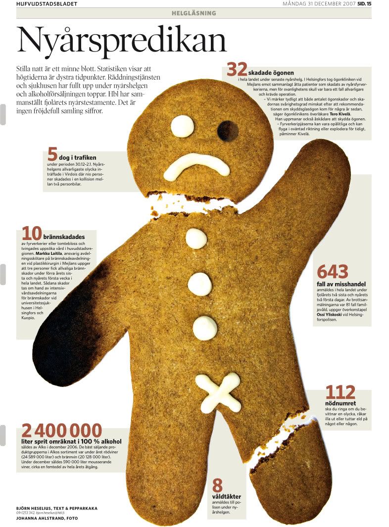
Holiday Injuries
And finally, a graphic that depicts an American poem: Howl.
Choose your own adventure ...
But, as this visual representation explores, you nearly always die in the end.
NFL Uniforms
This post won’t have any type of tutorial for a change… I know, pretty strange for me. Anyway, I was watching some football on Sunday with my Grandma (because I’m cool like that), and the Carolina Panthers/Tampa Bay Buccaneers game was on. My Grandma asked me who I was rooting for, and I said the Panthers. She asked which team that was, so I pointed them out. Then, she proceeded to say she’s rooting for them too. Why? Well, maybe it was partly due to the fact that I was – but she told me it was because she liked their uniforms. It’s pretty cool witnessing the effects that the aesthetics of a uniform can have on people, especially old ladies.
Color me curious
Yes, I just made a reference to an early 90s R&B group. Never mind that.
Let's talk about a possible revolution in the realm of color: a new e-paper technology that has the capability of giving new meaning to the theories of personalization and function in relation to visual aesthetics, according to this article from digitaltrends.com.
The paper, created by Philips Research, can actually change its color in real time thanks to a process called electrophoresis in which individual particles of the paper are suspended and electrically charged. The result is a substance which can change the density and saturation of colors by making colored particles spread across the paper.
Although the technology is being geared toward making "e-skins" for MP3 players or cell phones, the paper could one day expand to greater destinations. In the words of the article: "Imagine colored wallpaper."
As we studied in class, the color of an object can project a world of different emotions and messages. With such technology, those projections could possibly shift and create a whole new mission for visual aesthetics: create what is appealing to the eye -- right now.
Thoughts, anyone?
Perhaps a better title for this blog post would be "In moving color."
In the cards
As I was planning out how to possibly use different flash cards for Saturday's presentation, I bumped into the following site: Flashcardexchange.com.
For only a one-time fee of $20 (OK, $19.95), a person can create and print traditional flashcards or even come up with ones featuring images and videos. The site also features several programs that will show you one side of the card so you have to come up with the other. There is also a feature called "Cram Mode," which piqued my interest.
I realize that everything in the world is digital now, but I don't plan on abandoning the tried and true method of writing everything out. I think my printer has a tough job as it is without giving it more work.
That being said, I can see where a site like this would come in handy if you were taking a final that was based on all of the information you learned, especially if that information was mostly composed a simple facts, figures and definitions.
Has anybody used a site such as this one?
Web Trends for 2010
As the the semester comes to a close and many of are preparing to move forward with our web projects and make them a reality, I'd thought that the following links may be helpful when completing your designs:
Web design Trends for 2010
20 design features to help your blog stand out
Also, great job last night to all who presented in 501! I can't wait to see the end results.
Nick
Web design Trends for 2010
20 design features to help your blog stand out
Also, great job last night to all who presented in 501! I can't wait to see the end results.
Nick
Wednesday, December 9, 2009
The Original YouTube?
Have you ever heard of the mutoscope? Nah, me neither. Patented in 1894, the mutoscope was typically found in arcades, parlors and movie theaters.
It was one of the first motion picture devices, showing popular films of the day such as, "After He Bought Those Monkey Glands" and "The Lost Toupee." You've got to admit, those are some pretty wild film titles.
Some historians say that in many ways, the mutoscope was the original YouTube, which makes it especially interesting, as this article points out.
It was one of the first motion picture devices, showing popular films of the day such as, "After He Bought Those Monkey Glands" and "The Lost Toupee." You've got to admit, those are some pretty wild film titles.
Some historians say that in many ways, the mutoscope was the original YouTube, which makes it especially interesting, as this article points out.
Earth Text
I was very inspired by the “going green” presentation that Steve and Janelle gave in ICM 501 tonight. Therefore, I came home and searched for a Photoshop tutorial on nature. I came across this really cool text tutorial, which combines some photos with the text to create an amazing effect. I will paste the end-effect image from the website below – as well as a link to the tutorial. I haven’t given the tutorial a run through yet to make sure it’s easy to follow, but I will do so when I get more time (after the semester is over).
Click here for the tutorial.

Click here for the tutorial.
Digital Magazine: There's an App for that
The magazine Distill is a digest of photography and design from international fashion. Its latest issue goes all-digital in this app for the iPhone and iTouch. The navigation lets you take in art and copy digitally. You can check it out in this video.
Sorry for the upcoming flood ...
I realized we only have a few days left in the semester, and I have a bunch of things I tagged in my Delicious to mention in the blog!
I'll start with this collection of CG Portraits. We talked about the Uncanny Valley in 501a (as non-human things look more and more human, we think they're cute up to a point where they become unbearably creepy,) and I think these definitely qualify. *shudder* The interesting thing to note is that many of them were partially composed in Photoshop before being taken to other programs.
And since I'm talking about the power of Photoshop, I'll toss this in here too:
I love the Dove advertising campaign, because I think that the constant bombardment of heavily-altered pictures is becoming our vision of reality (just like Autotune has changed our relationship to the sound of the human voice). We talked about photo retouching in class, but does anyone think about the ethical dimensions of these tools? Like the photo of Demi Moore someone posted earlier (and Faith Hill's Redbook Cover Photo), how far is too far? The Ralph Lauren chop job? These are all extraordinarily beautiful women. Why do we need to photoshop them nearly to the point of being as uncanny as the portraits above?
I'll start with this collection of CG Portraits. We talked about the Uncanny Valley in 501a (as non-human things look more and more human, we think they're cute up to a point where they become unbearably creepy,) and I think these definitely qualify. *shudder* The interesting thing to note is that many of them were partially composed in Photoshop before being taken to other programs.
And since I'm talking about the power of Photoshop, I'll toss this in here too:
I love the Dove advertising campaign, because I think that the constant bombardment of heavily-altered pictures is becoming our vision of reality (just like Autotune has changed our relationship to the sound of the human voice). We talked about photo retouching in class, but does anyone think about the ethical dimensions of these tools? Like the photo of Demi Moore someone posted earlier (and Faith Hill's Redbook Cover Photo), how far is too far? The Ralph Lauren chop job? These are all extraordinarily beautiful women. Why do we need to photoshop them nearly to the point of being as uncanny as the portraits above?
Subscribe to:
Posts (Atom)